
“A picture is worth a thousand words.” That saying leads us to believe that we can readily interpret a chart correctly. But charts are visual arguments, and they are easy to misunderstand if we do not pay close attention. Alberto Cairo, chair of visual journalism at the University of Miami, reveals pitfalls in an example diagrammed here. Learning how to better read graphics can help us navigate a world in which truth may be hidden or twisted.
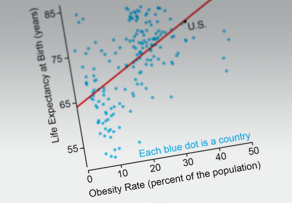
Say that you are obese, and you’ve grown tired of family, friends and your doctor telling you that obesity may increase your risk for diabetes, heart disease, even cancer—all of which could shorten your life. One day you see this chart (below). Suddenly you feel better because it shows that, in general, the more obese people a country has (right side of chart), the higher the life expectancy (top of chart). Therefore, obese people must live longer, you think. After all, the correlation (red line) is quite strong.

Credit: Alberto Cairo; Consultant: Heather Krause, Datassist; Sources: “Association between Class III Obesity (BMI of 40-59 kg/m2) and Mortality: A Polled Analysis of 20 Prospective Studies,” by Cari M. Kitahara et al., in PLOS Medicine; July 8 2014; CIA World Factbook (worldwide obesity rates, 2016); How Charts Lie: Getting Smarter about Visual Information, by Alberto Cairo, W. W. Norton (in press)
On supporting science journalism
If you're enjoying this article, consider supporting our award-winning journalism by subscribing. By purchasing a subscription you are helping to ensure the future of impactful stories about the discoveries and ideas shaping our world today.
The chart itself is not incorrect. But it doesn’t really show that the more obese people are, the longer they live. A more thorough description would be: “At the national level—country by country—there is a positive association between obesity rates and life expectancy at birth, and vice versa.” Still, this does not mean that a positive association will hold at the local or individual level or that there is a causal link. Two fallacies are involved.
First, a pattern in aggregated data can disappear or even reverse once you explore the numbers at different levels of detail. If the countries are split by income levels, the strong positive correlation becomes much weaker as income rises. In the highest-income nations (chart on bottom right), the association is negative (higher obesity rates mean lower life expectancy).
.png?w=1350)
Credit: Alberto Cairo; Consultant: Heather Krause, Datassist; Sources: “Association between Class III Obesity (BMI of 40-59 kg/m2) and Mortality: A Polled Analysis of 20 Prospective Studies,” by Cari M. Kitahara et al., in PLOS Medicine; July 8 2014; CIA World Factbook (worldwide obesity rates, 2016); World Bank (life expectancy at birth rates and income group classification, 2016); How Charts Lie: Getting Smarter about Visual Information, by Alberto Cairo, W. W. Norton (in press)
The pattern remains negative when you look at the U.S., state by state: life expectancy at birth drops as obesity rises.

Credit: Alberto Cairo; Consultant: Heather Krause, Datassist; Sources: “Association between Class III Obesity (BMI of 40-59 kg/m2) and Mortality: A Polled Analysis of 20 Prospective Studies,” by Cari M. Kitahara et al., in PLOS Medicine; July 8 2014; CDC (U.S. obesity rates, 2017); How Charts Lie: Getting Smarter about Visual Information, by Alberto Cairo, W. W. Norton (in press); Data for Wisconsin and Maine not Available
Yet this hides the second fallacy: the negative association can be affected by many other factors. Exercise and access to health care, for example, are associated with life expectancy. So is income.
.png?w=1350)
Credit: Alberto Cairo; Consultant: Heather Krause, Datassist; Sources: “Association between Class III Obesity (BMI of 40-59 kg/m2) and Mortality: A Polled Analysis of 20 Prospective Studies,” by Cari M. Kitahara et al., in PLOS Medicine; July 8 2014; CDC (U.S. obesity rates, 2017); How Charts Lie: Getting Smarter about Visual Information, by Alberto Cairo, W. W. Norton (in press); Data for Wisconsin and Maine not Available
The fallacy is trying to determine something about your individual risk by looking at aggregated data that do not reflect individual circumstances. If instead you saw data on individuals within a large sample of randomly selected people, you might discover that obesity may, or may not, relate to life expectancy for someone in your situation.
What to Do
Try to see not just what a chart shows but what it may not be showing.
Don’t jump to conclusions, particularly if a chart seems to confirm what you already believe.
Question whether you are correctly verbalizing the chart’s content.
Consider whether the data represent the level required to make the inferences you want. If you want to learn about countries, say, consult data at the country level, but if you want to learn about your own health risks, find data about individuals. And either way, always remember that, in a chart or among any data, correlation is not the same as causation.
