
Have you ever tried to cancel a service on a company's Web page? You look everywhere, but you just can't find the Cancel option. It's almost as though the company has hidden it on purpose.
You've just experienced the power of interface design. And as more elements of our lives become computerized—cars, elevators, ovens, refrigerators—good and bad (and sneaky) interface design is going to matter more and more. The mobile era makes the challenge even greater; it's especially difficult to cram a lot of features into limited screen space.
At the moment, millions of people, stymied by terrible software design, blame themselves. “I must just be a dummy,” they might mutter. “I guess I'm some kind of Luddite.”
On supporting science journalism
If you're enjoying this article, consider supporting our award-winning journalism by subscribing. By purchasing a subscription you are helping to ensure the future of impactful stories about the discoveries and ideas shaping our world today.
In fact, though, if a control doesn't work the way it should, or it isn't sitting where it ought to be, it may well be the designers' fault, not yours. It's time for interface design to enter the public dialogue, to matter just as much as price or customer service when we buy something.
Sometimes weird design choices are deliberate. It's no accident, for example, that a Web site's Sign Up button (for new customers) is almost always more prominent than the Sign In button (for existing customers).
But in other cases—many, many other cases—it seems clear that the creators of bad interface design just weren't thinking.
So today, in hopes of getting such a conversation going, I offer a few gentle suggestions for better software design. These are lessons for the designers, yes, but also for the rest of us—to use as a yardstick for assessing how well they've done their job.
Frequent features should be front and center. When you're filling in your address on a Web site, you're often asked to choose your country name from a menu. If you live in the U.S., you have to scroll past a couple of hundred countries in the alphabetical list!
The Internet is a global village. But by far the largest numbers of online visitors live in China, India and the U.S. Shouldn't their names appear at the top of the Country pop-up menu?
Better yet—why doesn't the Country field know the country you're in? (As Web advertising makes clear, it's trivial for a Web designer to figure that out.)
Consistency is secondary to frequency. Remember the PalmPilot pocket organizer? On its tiny screen, the address book app featured a prominent New button—and Delete was buried in a menu.
A Palm engineer explained to me why: Because new people enter your life a lot more often than they leave. You use Delete only when someone passes away, moves away or dumps you.
Step count matters. One click is always easier to learn and remember than several.
A classic example: If there are only two or three choices—say, Sleep, Restart and Shut Down—don't put them in a pop-up menu. Lay them all out on the screen; you have the room. Pop-up menus in general should be a last resort because nobody knows what options are in one until someone thinks to click it. And that's another step.
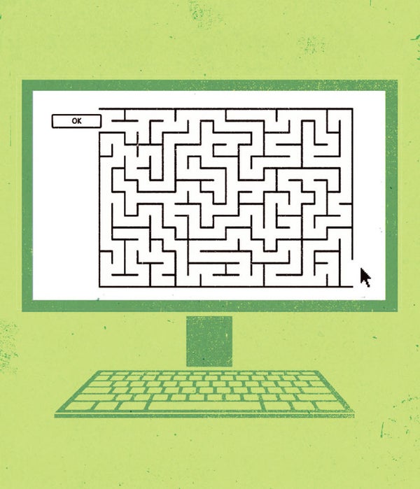
Words are crucial. Longtime geeks still chuckle at the infuriating ambiguity of the old Windows dialog boxes that had three buttons: Abort, Retry and Fail.
But guess what? Their descendants live on. To this day, I'd bet good money that lots of Windows users are confused by the choice of OK or Apply in dialog boxes—what's the difference?
Words matter in another way, too: A picture may be worth a thousand words but not when it's an unlabeled icon displaying a cryptic squiggle. Label your icons with words, people.
Many programmers are better at coding than writing—and that's fine. But someone who's better at writing than coding should have a look before the software goes final.
So there you have it: four pointers in the direction of better interface design. Next time you find yourself frustrated by a piece of technology, remember: let yourself off the hook. The fault may not be yours.
