
On supporting science journalism
If you're enjoying this article, consider supporting our award-winning journalism by subscribing. By purchasing a subscription you are helping to ensure the future of impactful stories about the discoveries and ideas shaping our world today.
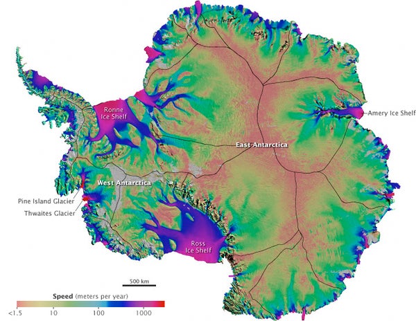
The first-ever map of how Antarctica's ice is moving across that continent has been created by researchers at the University of California, Irvine.
The map, along with an associated animation developed by NASA, reveals that ice is flowing fastest in coastal ice shelves and their tributaries, shown in this illustration in bright purple and blue. Though it's ice that's moving, not water, "you can imagine it like a river system," says Bernd Scheuchl, one of the map's creators. The fastest ice flows out to sea at a rate of a few kilometers a year. Pine Island and Thwaites Glaciers on the west coast are the most active.
The team was surprised by how far inland they found fast-moving ice, Scheuchl says. So, if Antarctica loses a great deal of its coastal ice to climate change in the coming decades, large quantities of interior ice could follow. "That's critical knowledge for predicting future sea level rise," NASA polar scientist Thomas Wagner said in a prepared statement.
To create this view of Antarctic ice flow, the UC Irvine researchers relied on data from satellites operated by Canada, Japan and the European Space Agency. Flow was tracked from 2007 to 2009 during a period of intense scientific monitoring of Earth's poles that researchers all over the world had agreed to do. A report on the map was published online August 18 in Science.
—Francie Diep
*Clarification (8/23/11): The headline was changed because the original implied the Antarctic maps indicate melting ice. The new headline more accurately states that the researchers have mapped moving ice, but this study says nothing about the amount of meltwater on which the ice flows.
