StatisticsSeptember 7, 2023
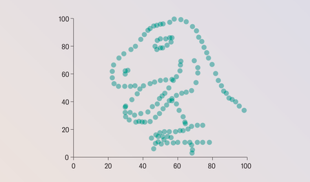
What This Graph of a Dinosaur Can Teach Us about Doing Better Science
“Anscombe’s quartet” and the “datasaurus dozen” demonstrate the importance of visualizing data
What This Graph of a Dinosaur Can Teach Us about Doing Better Science
“Anscombe’s quartet” and the “datasaurus dozen” demonstrate the importance of visualizing data

The U.S. Undercounts Climate-Driven Deaths
The full death toll from extreme heat waves, hurricanes and other climate-related disasters often isn’t revealed until weeks, months or even years after an event occurs


Statistics Are Being Abused, but Mathematicians Are Fighting Back
An expert explains how numbers can mislead and what she’s doing to help people understand them better
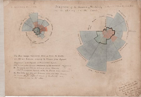
How Florence Nightingale Changed Data Visualization Forever
The celebrated nurse improved public health through her groundbreaking use of graphic storytelling