New Issue: Science’s Impossible Questions. Read Now

The Pulsar Chart That Became a Pop Icon Turns 50: Joy Division’s Unknown Pleasures

A classic data visualization brought an astronomical curiosity to music lovers

Harold D. Craft, Jr.

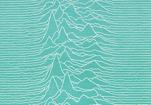
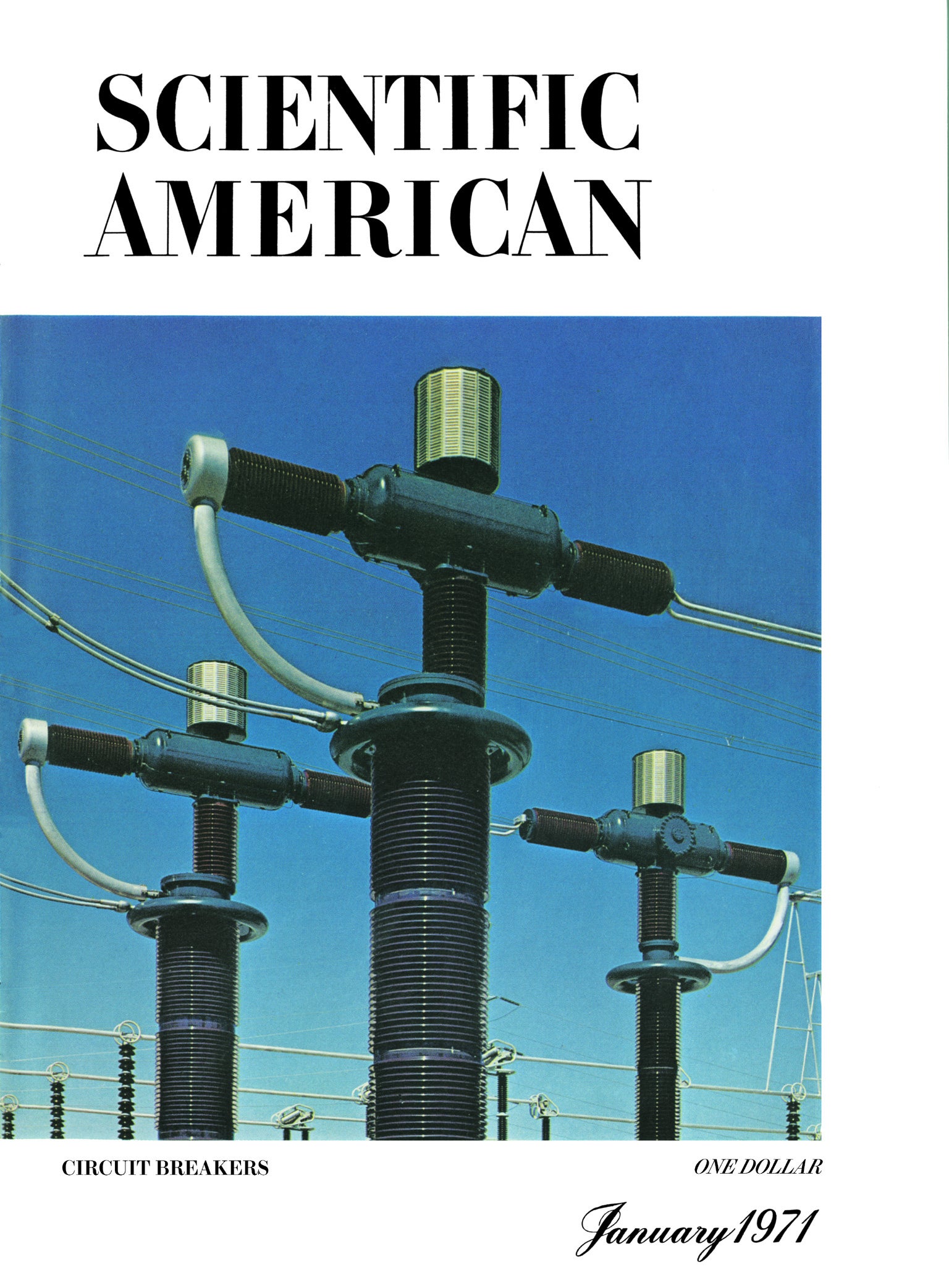
Fifty years ago this month Harold D. Craft, Jr., published a remarkable black-on-white plot in his Ph.D. dissertation at Cornell University. A stacked series of jagged lines displayed incoming radio waves from pulsar CP1919, as detected at Arecibo Observatory in Puerto Rico. Several months later the chart appeared as a full-page visualization in Scientific American, this time with white lines on a field of cyan.

A pulsar is a rapidly rotating neutron star that emits a radio-frequency beam that sweeps through space like a lighthouse beacon. In the graphic, 80 consecutive pulses—recorded at a frequency of 318 megahertz—are stacked. One pulse (shown from left to right) lasts about 0.04 second, with peak intensity near the center. Pulses occur every 1.337 seconds.

In 1979 the chart took a big step into public consciousness. Designer Peter Saville featured a white-on-black version as cover art for the English rock band Joy Division's Unknown Pleasures album, with no band name, album title or other identifiers—a bold move. On Scientific American's 175th anniversary we honor Craft's work and a data visualization that made the leap from student research to pop culture icon.


On supporting science journalism

If you're enjoying this article, consider supporting our award-winning journalism by subscribing. By purchasing a subscription you are helping to ensure the future of impactful stories about the discoveries and ideas shaping our world today.
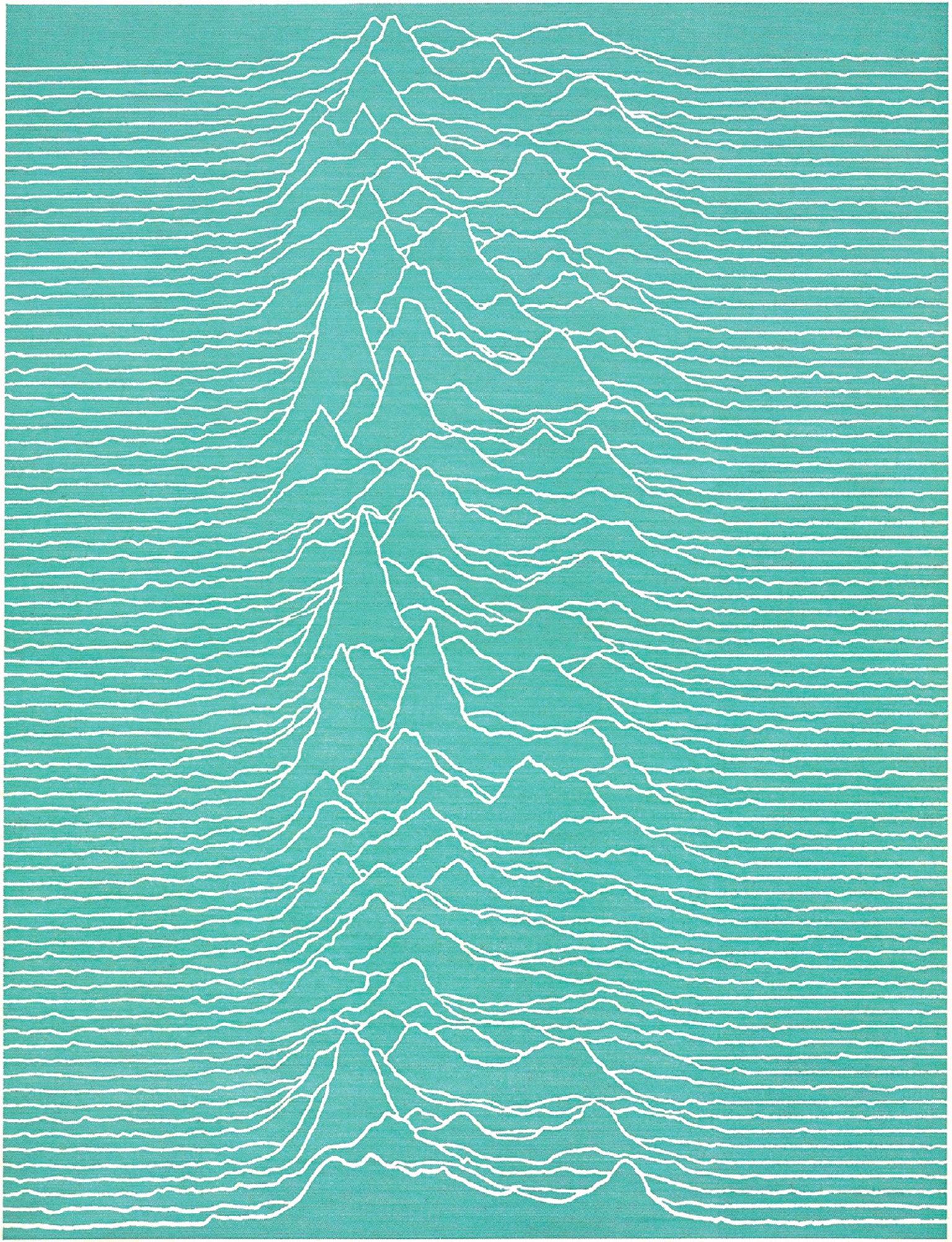

Credit: Harold D. Craft, Jr.; Source: “The Nature of Pulsars,” by Jeremiah P. Ostriker, in Scientific American, Vol. 224; No. 1; January 1971, modified from “Radio Observations of the Pulse Profiles and Dispersion Measures of Twelve Pulsars,” by Harold D. Craft, Jr.; September 1970
Scientific American

Jen Christiansen is an information designer, visual science communicator and author of the book Building Science Graphics: An Illustrated Guide to Communicating Science through Diagrams and Visualizations. She began her publishing career in New York City at Scientific American, moved to Washington, D.C., to join the art department of National Geographic, spent four years as a freelance science communicator and then returned to Scientific American for a second stint, during which she became the magazine’s first graphics-specific art director. In that role, she established a consistent data visualization and diagram philosophy across all articles. She writes and presents on topics ranging from reconciling her love for art and science to her quest to learn more about the pulsar chart on Joy Division’s Unknown Pleasures album cover. Her work can be viewed at www.jenchristiansen.com

More by Jen Christiansen
Scientific American Magazine Vol 323 Issue 3This article was published with the title “Pulsar as Pop Icon” in Scientific American Magazine Vol. 323 No. 3 (), p. 88
doi:10.1038/scientificamerican0920-88

Subscribe to Support Independent Journalism

Great science journalism requires human expertise, time, effort and creativity. And it costs money. That’s why I and the journalists here at Scientific American hope you’ll join our community.

When you subscribe, you are supporting staff and freelance journalists who are passionate about telling science stories that are true, important and compelling. Our editors and reporters are often experts in their fields, which means they understand the nuances of big discoveries and can untangle the breakthroughs from the hype. With a subscription, you are also supporting rigorous fact-checking to ensure the words we publish are precise and accurate. And you’re supporting original illustrations, graphics and photos that bring you closer to an advanced laboratory, an ice sheet in Antarctica or a space mission in orbit. You’re helping us craft other types of high-quality journalism as well: Our newsletters are carefully written, edited and curated by staffers you have or will come to know and love. Our Science Quickly podcast is based on original reporting, collaboration with editors and scientists and exacting production.

Subscriptions keep this engine running so we can continue to deliver thoughtful, rigorous and independent science journalism to you. In an era of viral misinformation, this work is crucial. If you value what we do, I hope you’ll consider joining us as a subscriber

Thank you,

Jeanna Bryner, Editor in Chief, Scientific American

Subscribe