EducationJune 16, 2026
See how academic freedom is changing around the world
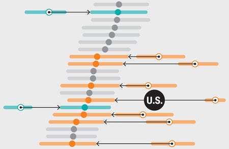
Some countries have seen a stark decline in academic freedom over the past decade
Jen Christiansen is a senior graphics editor at Scientific American, where she art directs and produces illustrated explanatory diagrams and data visualizations. She is also author of the book Building Science Graphics: An Illustrated Guide to Communicating Science through Diagrams and Visualizations (CRC Press). In 1996 she began her publishing career in New York City at Scientific American. Subsequently she moved to Washington, D.C., to join the staff of National Geographic (first as an assistant art director–researcher hybrid and then as a designer), spent four years as a freelance science communicator and returned to Scientific American in 2007. Christiansen presents and writes on topics ranging from reconciling her love for art and science to her quest to learn more about the pulsar chart on the cover of Joy Division’s album Unknown Pleasures. She holds a graduate certificate in science communication from the University of California, Santa Cruz, and a B.A. in geology and studio art from Smith College. Follow Christiansen on Bluesky @jenchristiansen.com
See how academic freedom is changing around the world
Some countries have seen a stark decline in academic freedom over the past decade
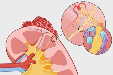
The number of kidney patients is going up
Chronic kidney disease has a variety of causes, ranging from immune system problems to medication side effects
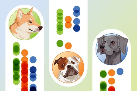
From anxious Weimaraners to aggressive Chihuahuas: What science can tell us about dog breeds
A large dataset shows some dog stereotypes are based in reality, and others might be unfair characterizations

Your guide to 29 wildly different theories of consciousness
The many, many ways researchers hope to solve the toughest mystery in science
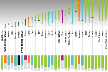
Here’s a Nuanced Look at Type 1 Diabetes Cases Worldwide
This autoimmune disease impacts millions of people worldwide, with some underserved communities bearing the brunt
Alzheimer’s Drugs Are Finally Tackling the Disease Itself. Here’s How
While our understanding of Alzheimer’s disease is far from complete, the latest therapies, and others in more than 100 clinical trials, offer new hope
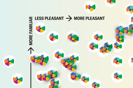
The Surprising Science behind Your Favorite (and Least Favorite) Scents
More familiar smells and scents from complex molecules can often be more appealing
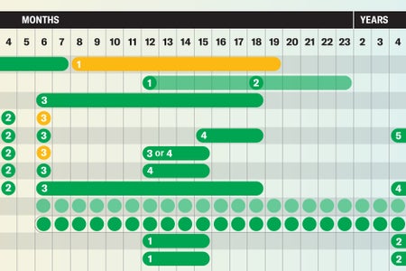
See Vaccine Recommendations Backed by Science in These Handy Charts
These graphics will guide you through science-based vaccine guidelines for children and adults
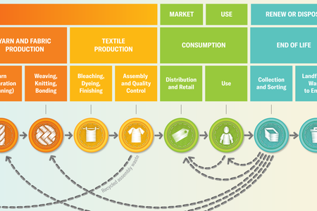
How to Be a Smarter Fashion Consumer in a World of Overstated Sustainability
Outsmart greenwashing with tips for more sustainable clothing
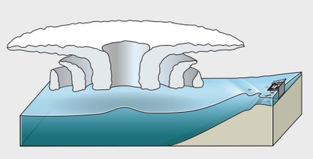
Why Storm Surge Is Dangerous—And Becoming More Frequent
How hurricanes push water onto shore in deadly storm surges, and why storm surges are getting worse

Which Knot Is Stronger? Humans Aren’t Great Judges
People are surprisingly bad at guessing knot strength, a study found

How Does Sharing a Nobel Prize Work?
Joint Nobel laureates aren’t necessarily direct scientific collaborators, and the prize money isn’t always split evenly
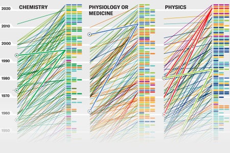
Hidden Patterns Show Nobel Prize Science Trends
Time lags between discoveries and awards show how the Nobel Prizes reward science
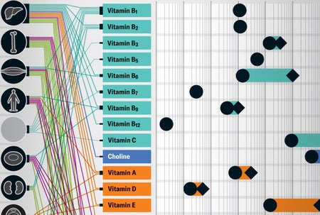
What Vitamins and Minerals Really Do in Your Body
Humans need around 30 vitamins and minerals to keep our bodies functioning
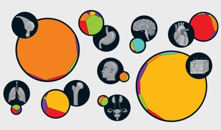
See Your Body’s Cells in Size and Number
The larger a cell type is, the rarer it is in the body—and vice versa—a new study shows
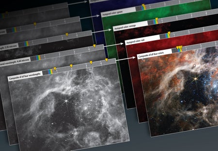
Are the James Webb Space Telescope’s Pictures ‘Real’?
How the JWST’s cosmic images are made
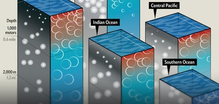
How the Ocean Sustains Complex Life
Detailed data about a host of physical and chemical forces are shaping a new view of the sea
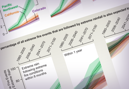
Wildfires Followed by Severe Rain Will Become More Common
Graphics show how the two weather extremes will more often pair up
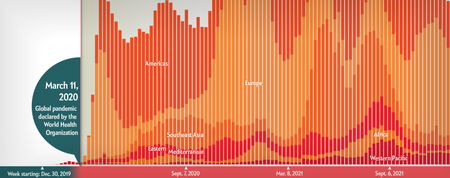
COVID’s Uneven Toll Captured in Data
Visualizing ongoing stories of loss, adaptation and inequality
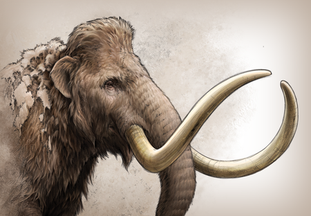
Mammoth Tusk Reveals Ancient Mammal’s Travels
Chemical analyses showed an individual mammoth made an epic journey across Alaska
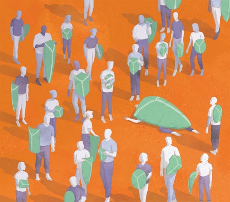
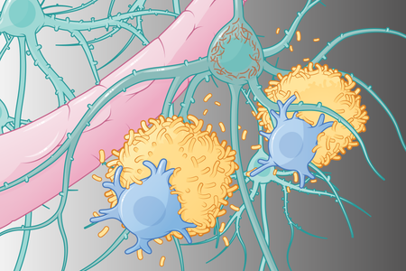
The Terrible Toll of 76 Autoimmune Diseases
About 80 conditions can be described as autoimmune disorders, although definitions are still changing
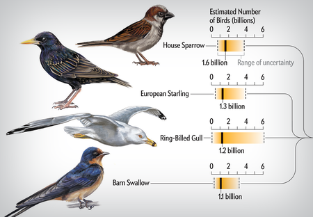
Bird Species Abundances, from Biggest to Smallest
A new study found large species are rare, but those with fewer individuals are abundant
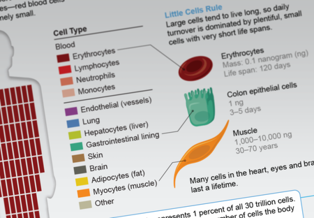
Our Bodies Replace Billions of Cells Every Day
Blood and the gut dominate cell turnover
Sunlight Changes Unequally All Year Long
Some days we gain one minute; some days we gain three