Public HealthNovember 9, 2020
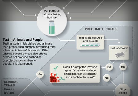
Coronavirus Vaccine Is 90 Percent Effective in Large Trial, Pfizer Says
Genetic engineering could allow for speedy production as well
Jen Christiansen is acting chief of design and senior graphics editor at Scientific American, where she art directs and produces illustrated explanatory diagrams and data visualizations. She is also author of the book Building Science Graphics: An Illustrated Guide to Communicating Science through Diagrams and Visualizations (CRC Press). In 1996 she began her publishing career in New York City at Scientific American. Subsequently she moved to Washington, D.C., to join the staff of National Geographic (first as an assistant art director–researcher hybrid and then as a designer), spent four years as a freelance science communicator and returned to Scientific American in 2007. Christiansen presents and writes on topics ranging from reconciling her love for art and science to her quest to learn more about the pulsar chart on the cover of Joy Division’s album Unknown Pleasures. She holds a graduate certificate in science communication from the University of California, Santa Cruz, and a B.A. in geology and studio art from Smith College. Follow Christiansen on Bluesky @jenchristiansen.com
Coronavirus Vaccine Is 90 Percent Effective in Large Trial, Pfizer Says
Genetic engineering could allow for speedy production as well
The Language of Science
How the words we use have evolved over the past 175 years
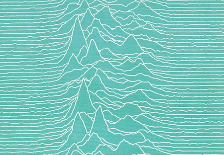
The Pulsar Chart That Became a Pop Icon Turns 50: Joy Division’s Unknown Pleasures
A classic data visualization brought an astronomical curiosity to music lovers
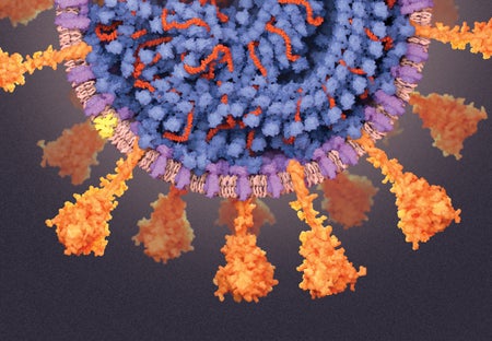
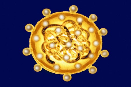
A Visual Guide to the SARS-CoV-2 Coronavirus
What scientists know about the inner workings of the pathogen that has infected the world
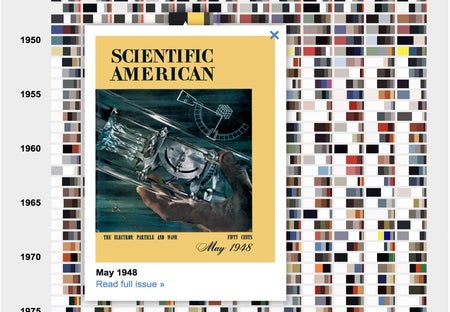
Scientific American’s Colorful Covers Reveal 175 Years of Change
The magazine’s hues provide a record of publishing technology and trends
Visualizing Science: Illustration and Beyond
Where does the illustrator end and the infographer begin? How does data visualization fit in? And what does science have to say about the design decisions we make?
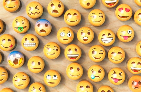
Only 150 of Your Facebook Contacts Are Real Friends
Even with social media, we max out at 150 real relationships
Global Infections by the Numbers
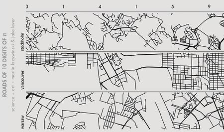
Pi City
Data visualizers Martin Krzywinski and Jake Lever map city centers for an annual Pi Day art exploration

Mass Extinction in Earth’s Oceans Could Begin by 2100
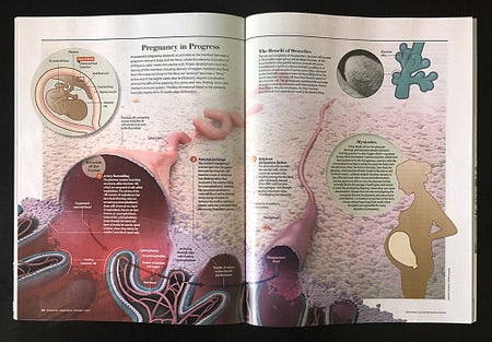
The Evolution of a Scientific American Graphic: Pregnancy in Progress
When we return to a topic where the research has advanced, our visual explanations need to be updated accordingly
Circadian Rhythms, Illustrated
A graphic from the Scientific American archive provides a look into the brain’s molecular clock—research that contributed to this year’s Nobel Prize in Physiology or Medicine
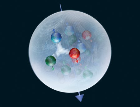
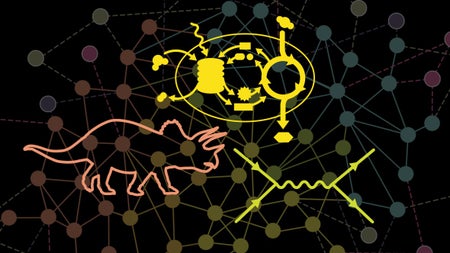
Visualizing the Innards of Subatomic Particles
With a nod to the recently discovered Xi-cc++ particle, here’s a look at the quantum foam that lies within
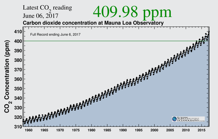
Revisiting a Climate Data Viz Icon
This humble 59-year-old chart reveals that atmospheric carbon dioxide levels continue to climb upward
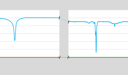
Unexplained Light Curves
Boyajian’s star is dimming again. This graphic shows why that’s weird.
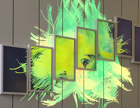
Interactive Brain Art
A new media installation at Columbia University renders the brain larger than life
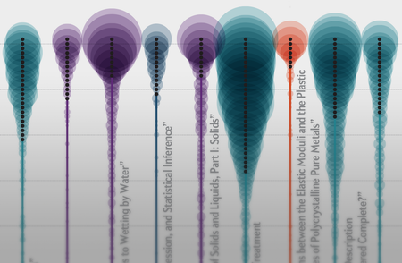
Sleeping Beauties of Science
Scientific American graphic about slumbering research papers wakes up for an award
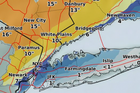
Visualizing Uncertain Weather
Storm prediction is tricky business. So is illustrating it
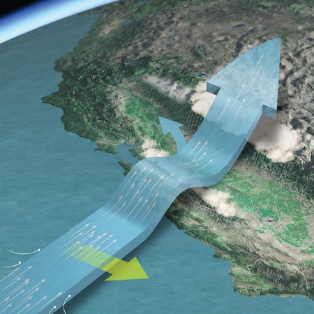
Atmospheric Rivers, Illustrated
Graphics from the Scientific American archive show how these storm systems impact California
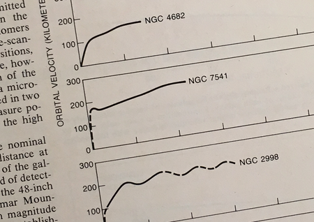
Vera Rubin's Numbers
Evidence for dark matter is visible in this elegant set of simple charts, rooted in data published decades ago
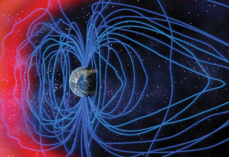
Solar Superstorms, Illustrated
An executive order calling for more preparedness and better forecasting for space weather is creating a buzz about electromagnetic storms. What are they?
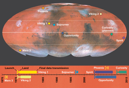
Landing on Mars: How and When
A graphic from the Scientific American archive provides context for this month’s Mars landing attempt
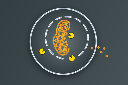
Autophagy, Illustrated
A graphic from the Scientific American archive shows how cells clean house—the basics behind this year’s Nobel Prize in Physiology or Medicine
Visualizing Polls
A playful, explorable explanation demonstrates the impact of chance on poll results