PolicySeptember 16, 2016
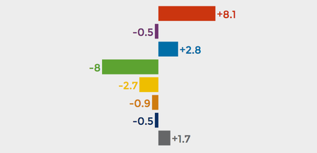
Visualizing Polls
A playful, explorable explanation demonstrates the impact of chance on poll results
Jen Christiansen is an information designer, visual science communicator and author of the book Building Science Graphics: An Illustrated Guide to Communicating Science through Diagrams and Visualizations. She began her publishing career in New York City at Scientific American, moved to Washington, D.C., to join the art department of National Geographic, spent four years as a freelance science communicator and then returned to Scientific American for a second stint, during which she became the magazine’s first graphics-specific art director. In that role, she established a consistent data visualization and diagram philosophy across all articles. She writes and presents on topics ranging from reconciling her love for art and science to her quest to learn more about the pulsar chart on Joy Division’s Unknown Pleasures album cover. Her work can be viewed at www.jenchristiansen.com
Visualizing Polls
A playful, explorable explanation demonstrates the impact of chance on poll results
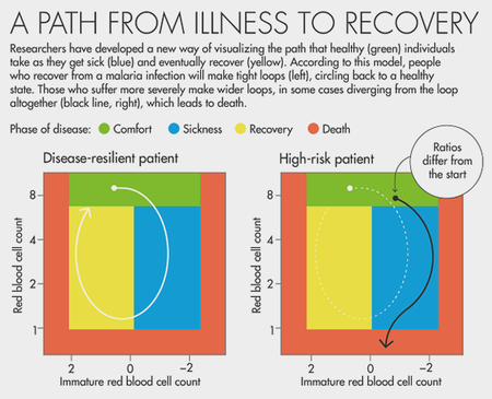
Charting Health Trajectories
Connected scatter plots highlight differences between disease-resilient and high-risk patients
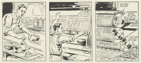
Publishing on Printing
Learning from Scientific American’s 171 years of covering advances in printing technology
Neural Networks for Artists
From hallucinogenic-like DeepDream composites to mesmerizing style-transfer videos, visuals provide an engaging entry point to the world of machine learning
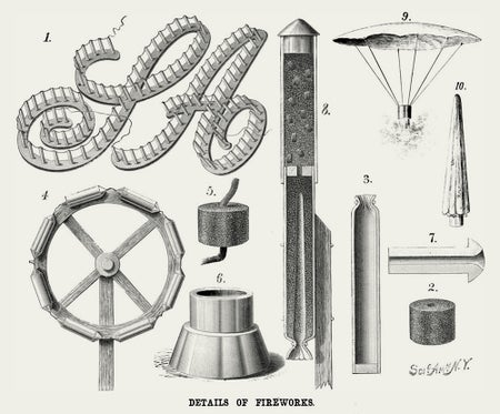
Aerial Fireworks, Illustrated
Graphics from the Scientific American archive provide a glimpse of the history and science of pyrotechnics
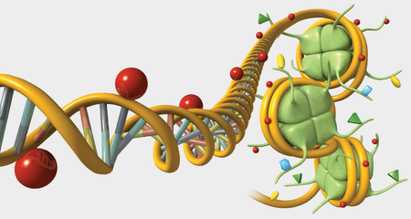
Gene Regulation, Illustrated
What are epigenetic modifications, and how might they play out across generations?
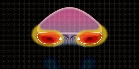
Jellyfish in Motion
Animation shows how a moon jelly propels itself using spinning wheels of water

Dude, How Did Scientific American End Up in This Jerry Garcia–Howard Wales Album Art?
Do you think it was the issue with the article on “Marihuana”? Mysteries from the inside cover of Hooteroll?
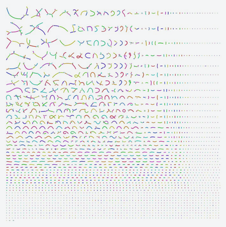
How to Read the Latest Zika Vector Genome Chart
Efforts to learn more about the mosquito that transmits Zika have resulted in a new visualization, but what does it show?
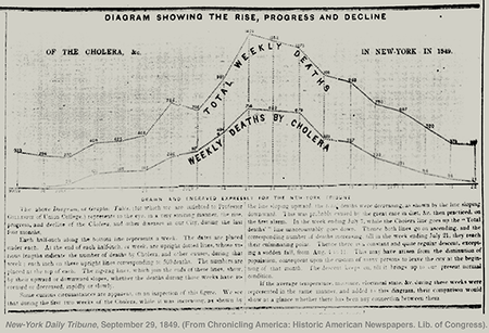
Visualizing Cholera in the mid-1800's
An Article on Graphics in the Time of Cholera Prompts a Review of the Scientific American Archive

Visualizing Protein Structures
Early schematics by Jane Richardson lay the foundation for her ubiquitous ribbon diagrams

The Science of Visualization
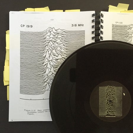
Pop Culture Pulsar: The Science Behind Joy Division’s Unknown Pleasures Album Cover

Before Scientific American, There Was Rufus Porter
A visit to the Rufus Porter Museum reveals the restless creativity of Scientific American’s founder—from hand-painted murals to DIY science experiments and self-published treatises

A Climate Change Data Visualization Gains National Landmark Status
A graph that plots rising CO2 over the decades has always been a lesser known icon in demonstrating the reality of global warming.

There's No Infographic Without Info (and other Lessons from Malofiej)
News graphics professionals converged in Pamplona, Spain for the 23rd annual Malofiej Information Graphics World Summit for one week last month.
Subatomic Particles Over Time: Graphics from the Archive, 1952-2015
In the May issue of Scientific American, a familiar friend makes an appearance: a chart of fundamental particles. These particles—fermions (which include constituents of matter such as electrons and quarks) and bosons (usually carriers of force)—are at the very heart of the Standard Model of particle physics.
The Oceans' Origins and the Evolution of a SciAm Infographic
When it comes to developing an illustrated information graphic, sometimes you don’t really know what sorts of details you’re going to need until you dive in and start drawing.
Pop Culture Pulsar: Origin Story of Joy Division’s Unknown Pleasures Album Cover [Video]
Sure, I was familiar with the graphic—and I’m not alone. Drop this image (right) on someone’s desk and chances are they’ll reflexively blurt, “Joy Division.” The band’s 1979 Unknown Pleasures album cover leaned entirely on a small mysterious data display, printed in white on black.
How to Choose the Form of an Infographic: It's All About Context
As a graphics designer, I have a love/hate relationship with circles. The humble form provides a relief from rigid rectangular chart structures that are pinned to x- and y-axes.
Math Is Beautiful, But Is It Art?
Every so often, beauty comes up as a topic of conversation in editorial meetings at Scientific American. Surely there’s an article, or series of articles that we can develop on the topic?
The Murals of Scientific American Founder Rufus Porter
Perhaps the tweet below from editor-in-chief Mariette DiChristina last weekend shouldn’t have been a surprise. After all, I knew that Rufus Porter, founding editor and publisher of Scientific American, was a well-rounded fellow.
The Evolution of a Scientific American Information Graphic: Clues to Dampening Pain
Every graphic is a new adventure. Some of our magazine articles involve abstract concepts that require lots of time and energy at the front-end, making decisions about what, exactly should be illustrated.
Mars' First Close-up
Today marks the 50th anniversary of the launch of NASA’s Mariner IV spacecraft (November 28, 1964). In total, the mission gave us 21 complete images of Mars, including this, our first close view of the planet—courtesy of data transmitted by the interplanetary probe and earth-bound scientists wielding pastels (below).