Space & PhysicsNovember 1, 2014
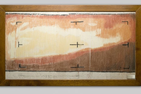
First View of Mars Was a Paint-by-Numbers
We've come a long way since NASA's Mariner 4
Jen Christiansen is an information designer, visual science communicator and author of the book Building Science Graphics: An Illustrated Guide to Communicating Science through Diagrams and Visualizations. She began her publishing career in New York City at Scientific American, moved to Washington, D.C., to join the art department of National Geographic, spent four years as a freelance science communicator and then returned to Scientific American for a second stint, during which she became the magazine’s first graphics-specific art director. In that role, she established a consistent data visualization and diagram philosophy across all articles. She writes and presents on topics ranging from reconciling her love for art and science to her quest to learn more about the pulsar chart on Joy Division’s Unknown Pleasures album cover. Her work can be viewed at www.jenchristiansen.com
First View of Mars Was a Paint-by-Numbers
We've come a long way since NASA's Mariner 4

Stunning Infographics Net SciAm Two Awards
I’m thrilled to report that two Scientific American graphics (on bees and caffeine) are featured in The Best American Infographics 2014.
Art and Science of the Moiré
I’m a bit obsessed with Scientific American covers, but my knowledge of the archive during the years before my time on staff is broad rather than deep.
Beyond Classic Brain Illustrations That Make Us Drool
I threw down a bit of a challenge last month at the Association of Medical Illustrators Conference in Minnesota. But first, I had to—somewhat unexpectedly—accept some challenges presented by others.
A Look under the Hood of Online Data Visualization
Andy Kirk (of Visualising Data) recently published a clever image-driven post in which he uses automobiles to make a series of points about the practice of data visualization.
On Climate Surveys, the People Agree—Mostly [Interactive]
It’s interesting to see how different points can pique the interest of different people looking at the same data set. My colleague Mark Fischetti (senior editor and partner-in-crime for many of the Graphic Science items in the magazine) was intrigued by bipartisan agreement on questions related to global warming in the survey results shown in [...]
How do YOU Visualize the Brain?
Here at Scientific American, we develop lots of infographics about the brain. From classic neural pathway diagrams, depictions of medical breakthroughs, and maps of the brain’s genetic activity, there are as many solutions for visualizing the brain as there are questions about how it works.
Scientific American Graphics Win 2 Medals at Malofiej
The 22nd annual Malofiej International Infographics Summit (hosted in Pamplona, Spain by the Spanish chapter of the Society for News Design) concluded today with award announcements.

Evolution of the Scientific American Logo
Scientific American's logotype has undergone subtle shifts, large leaps and occasional bouts of nostalgia. The image series below outlines the history of the publication's identity, starting with its debut in August 1845 as weekly devoted primarily to inventions
Don’t Just Visualize DataVisceralize It
The title of this post borrows from ideas presented by Sha Hwang at the Visualized conference in New York City several weeks ago: He kicked off the data-visualization event with a talk that—in effect—challenged the audience to take a step back.
Scientific American Covers Reveal a Shift from Practical to Provocative
4 Ways to Venus: An Artists Assignment
Irving Geis (1908-1997) is probably best known for illustrations of biological macromolecules, such as his groundbreaking watercolor painting of myoglobin—an exhaustive and beautiful portrait of the first properly sorted protein molecule.
How I Reconciled My Love for Art and Science
In college in the 1990s, I suffered an identity crisis. Was I a scientist or an artist? I loved the clarity and order inherent to the scientific process; ask questions, set up methodologies, collect data, analyze.
The Evolution of a Scientific American Information Graphic: Where the Wild Bees Are
Have you ever wondered how—and why—infographers push beyond familiar forms such as bar charts and network diagrams when translating information from a spreadsheet into an illustration?
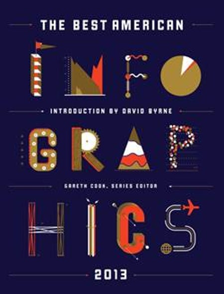
The Best American Infographics
“The same forces that have made it possible for infographics to proliferate have also made us hungry for them. We are deluged with information, and infographics promise to make sense of it...
Reading Roundup: Renewable Energy
Additional resources for the October issue’s Graphic Science on the hidden costs of renewable energy
No-Kill, High-Resolution 3-D Movies of Cells Now Possible
A new 3-D imaging technique shows that higher resolution is not the only desirable trait for microscopic observations
Behind the Curtain at Malofiej—Mecca for Visual Journalists
On Saturday, March 8, I arrived in Pamplona, Spain, a familiar destination for many in the information graphics community. Pamplona isn’t the easiest destination in Spain to reach—from anywhere, really.
Behind the Curtain at Malofiej Mecca for Visual Journalists
Scientific American Graphics Win 3 Bronze Medals at Malofiej
Last week, the world information graphics community convened in Pamplona, Spain, for the 21st annual Malofiej International Infographics Summit and Awards, organized by the Spanish chapter of the Society for News Design.
Scientific American Graphics Win 3 Bronze Medals at Malofiej
Storytelling with Big Data: Thoughts on VISUALIZED
As an attendee at the inaugural VISUALIZED conference last week in New York City, I was ready to experience, as the website described, “an inspiring two-day gathering with the brightest minds and social innovators from around the world who are changing how we understand and interact with data; and gain insight into designing data-driven narratives [...]
Storytelling with Big Data: Thoughts on VISUALIZED
A Defense of Artistic License in Illustrations of Scientific Concepts
The other day, my own hypocrisy slapped me in the face. I was looking at a quantum illustration. One for which I had just encouraged an artist to develop a dimensional and detailed representation of a particle, that—by the author’s own admission—may or may not exist.