
This article was published in Scientific American’s former blog network and reflects the views of the author, not necessarily those of Scientific American

From “Public Opinion Polls” by Rensis Likert, Scientific American, December 1948
As Rensis Likert sets forth in the December 1948 issue of Scientific American, validity of the public opinion polling process hinges on two factors; the population sample, and the questionnaire (interview method and analysis of the responses). The first was largely blamed for the presidential polling failure of 1948, in which Thomas Dewey was erroneously predicted to defeat Harry Truman soundly. The problem was with the so-called quota-controlled sampling method, in which each pollster was assigned a certain number of individuals according to a list of demographic variables, like age, gender and socio-economic level. Bias may have entered the picture when it came time for pollsters to actually fill those quotas, however. As Likert wrote,
“A major source of bias in quota samples is the fact that interviewers, in a perfectly human fashion, endeavor to fill their quotas in the easiest manner possible. They go to places where people are readily available and seek any who will fill the age, sex, and socio-economic specifications of their quotas. They tend, therefore, to secure a sample which is biased in that it includes more people who are easily contacted than a truly representative sample should include.”
On supporting science journalism
If you're enjoying this article, consider supporting our award-winning journalism by subscribing. By purchasing a subscription you are helping to ensure the future of impactful stories about the discoveries and ideas shaping our world today.
What's the alternative? Arguably, so-called probability sampling—an approach that employs random procedures for interviewee selection—is more accurate, leaving less to human bias in terms of sample selection.
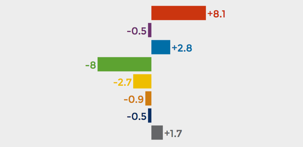
But as Belgian data journalist Maarten Lambrechts demonstrates in his explorable explanatory graphic “Rock n’ Poll,” even probability sampling-based polls can be misleading, if taken at face value. Not surprisingly, dramatic variations in results occur with small sample sizes. But, as you work through the interactive, it becomes clear that even very large samples are visibly impacted by chance. Which underscores Lambrechts' reason for developing the graphic. As he wrote in his blog,

Image from Rock n’ Poll
CREDIT: Maarten Lambrechts
Click the image to launch the interactive

Image from Rock n’ Poll
CREDIT: Maarten Lambrechts
Click the image to launch the interactive
“The reporting on political polls in my country has been annoying me for a long time. Statistically insignificant changes in political preferences are overanalyzed and margin of errors are not taken into account or even not mentioned at all. As a result, a lot of journalistic fire power is spent on analyzing randomness and readers are just plainly misinformed….I decided to take the concept of Explorable Explanations and apply it to (political) polls in order to show the uncertainty that is inherent in polling results.”
The result is a playful poll primer that demonstrates that focusing on fractions of poll percentage points is an exercise in futility. Travel to the fictional country of PollLand and explore for yourself.
Then restore your faith in polls that nod to those margins of error with a glimpse behind the curtain, courtesy of FiveThirtyEight’s election forecast user's guide.