
This article was published in Scientific American’s former blog network and reflects the views of the author, not necessarily those of Scientific American
Starting with a data set of all the world’s roads (courtesy of Open Street Map), Martin Krzywinski and Jake Lever zoomed into 44 city centers and the lines that define them for data art in celebration of Pi Day, 2018.
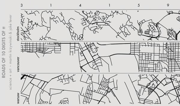
Each road was broken into “polylines”; segments between intersections or an intersection and the road’s end. These polylines form the basis for the calculations and tiling to follow, resulting in two assemblage styles: city strips and world patches.
As Krzywinski describes:
On supporting science journalism
If you're enjoying this article, consider supporting our award-winning journalism by subscribing. By purchasing a subscription you are helping to ensure the future of impactful stories about the discoveries and ideas shaping our world today.
“City strips were created by sampling patches of 0.015 × 0.015 degrees (after transformation). This corresponds roughly to 1.7 kilometers. For each position in the strip, patches were sampled in order of the digits of π only if the number of polylines in the patch was 40d≤N<40(d+1)−1, where d is the digit of π. Patches for d=9 only need to have 360≤N polylines. For example, the first patch is assigned to d=3 and it must have 120≤N<159 polylines. The second patch is sampled so that its density is 40≤N<79 because it is associated with the next digit, d=1. Further selection on acceptable patches is performed so the streets line up with the previous patch. Minor local adjustments and stitching are performed so the join appears seamless.”
.png?w=1350)
Roads of 10 Digits of Pi (3.141592653); From top to bottom: Moscow, Mumbai, Nairobi, New Delhi, Nice, Prague, Rome, Stockholm, Vancouver, Warsaw. Credit: Martin Krzywinski and Jake Lever
The world patch series steps up in complexity, mapping out 36 digits of pi in two dimensions, sampling from more than one city. (For more details, see Krzywinski’s explanatory post).
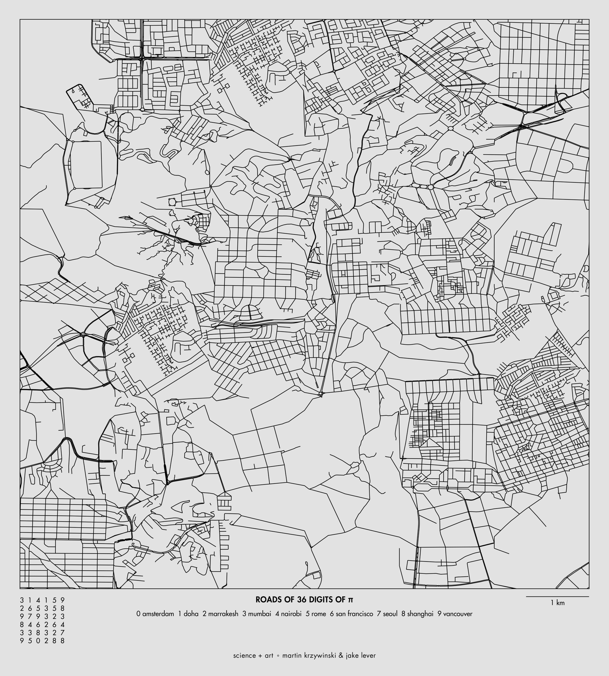
Roads of 36 Digits of Pi (3.14159265358979323846264338327950288); Featuring Amsterdam, Doha, Marrakech, Mumbai, Nairobi, Rome, San Francisco, Seoul, Shanghai and Vancouver. Credit: Martin Krzywinski and Jake Lever
Although intellectually I’m drawn to the idea and the complexity of the global world patch mash-up, I find the city strips to be more satisfying. With district horizontal panels, my eye has a clear path, and I can see the pi pattern play out in road density. The apparent pattern is then reinforced by the next city row and the next, each with a distinctive city road structure—from the grid of Vancouver to the gestural lines of Nice.
For more pi-inspired art, see “Pi in the Sky,”“The Boundless Beauty of Pi,” and “The Gravity of Pi.”