
This article was published in Scientific American’s former blog network and reflects the views of the author, not necessarily those of Scientific American
In a blog post last month, Scientific American editor Seth Fletcher shared an interview with Andrew Strominger, in which the Harvard physicist attempts to explain the controversial new paper he recently published, in collaboration with Stephen Hawking and Malcom J. Perry, on black holes and the so-called information paradox. The content of the interview is both intriguing and comprehensible, at least in terms of the language used. But as the conversation moved swiftly past the essentials of the information paradox—the idea that black holes destroy information, which defies the laws of physics as we know them—and onto Hawking’s novel “soft hair theorem,” I found myself scrolling down in search of a visualization of some kind to help me process the words I was reading.
Towards the end of the article, there was indeed a graphic of sorts: a Penrose diagram apparently depicting “a semiclassical evaporating black hole, as presented in ‘Soft Hair on Black Holes.’”

Diagram from “Soft Hair on Black Holes,” by Prahar Mitra
On supporting science journalism
If you're enjoying this article, consider supporting our award-winning journalism by subscribing. By purchasing a subscription you are helping to ensure the future of impactful stories about the discoveries and ideas shaping our world today.
After a quick Wikipedia search for “Penrose diagram,” I had gained a very superficial understanding of how to read such an image (vertical dimension = time; horizontal = space), but beyond that, I must admit I was lost. Where was the structure of the black hole? Where was this so-called hair, and how was I to observe its alleged softness?
What I needed was a good infographic to demonstrate the basics of black holes and the information paradox. Again, I took to the internet, and lo and behold, not only did I find an infographic, I found it in Scientific American, within an article by Roger Penrose himself.
.png?w=1350)
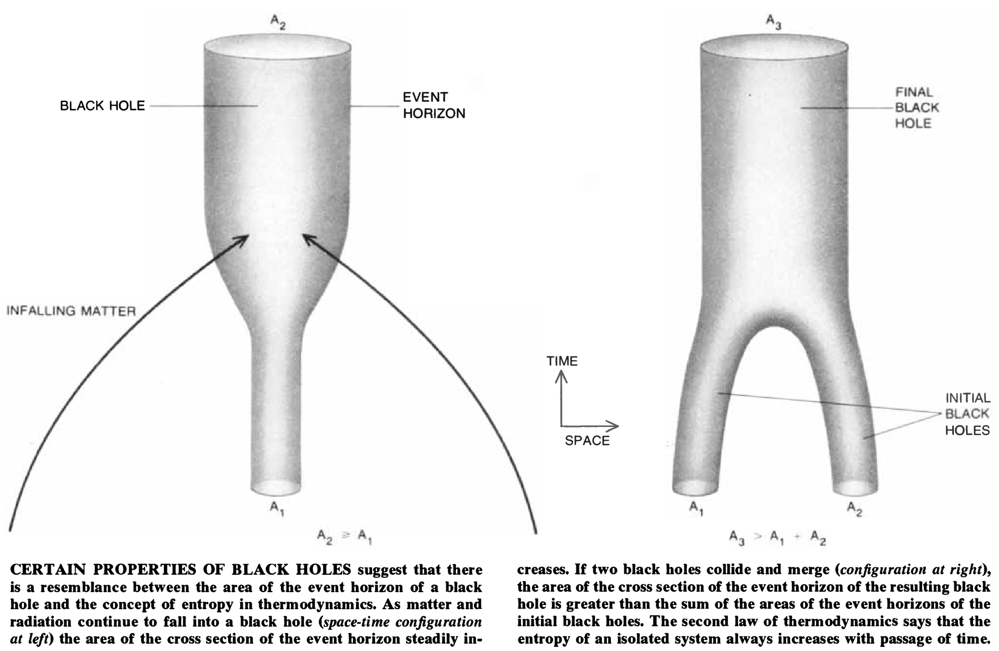
Graphics by Alan Beechel
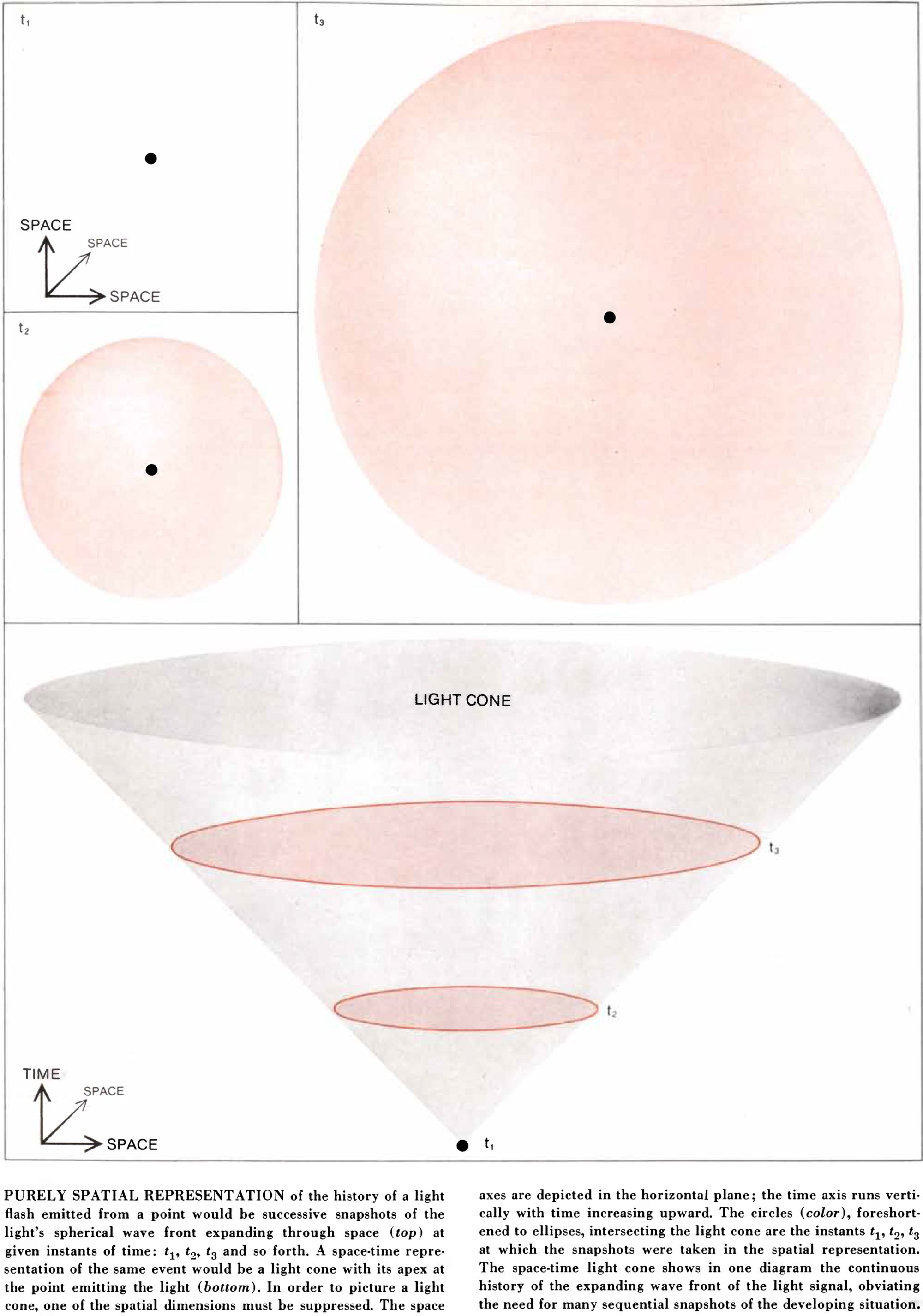
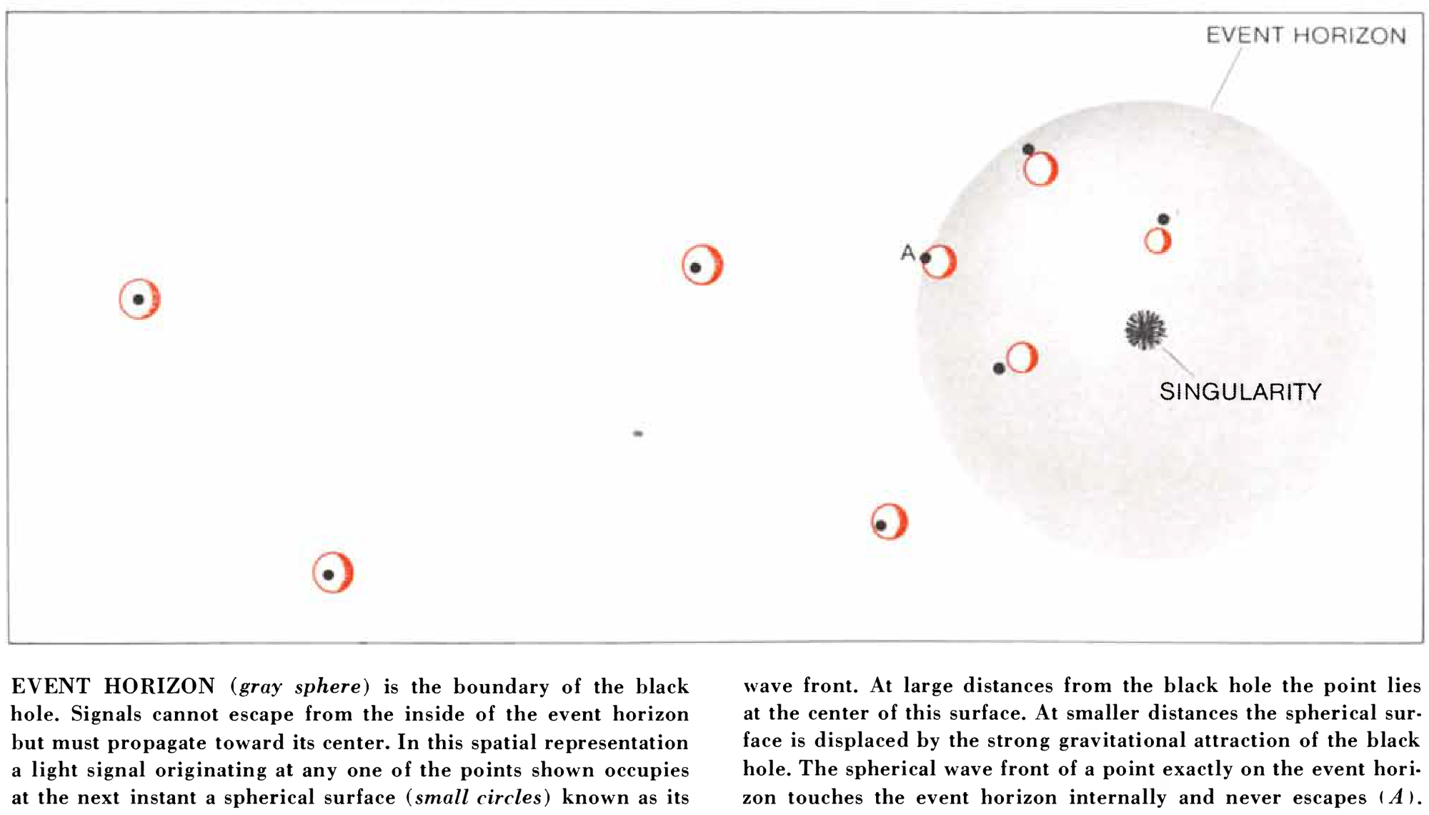
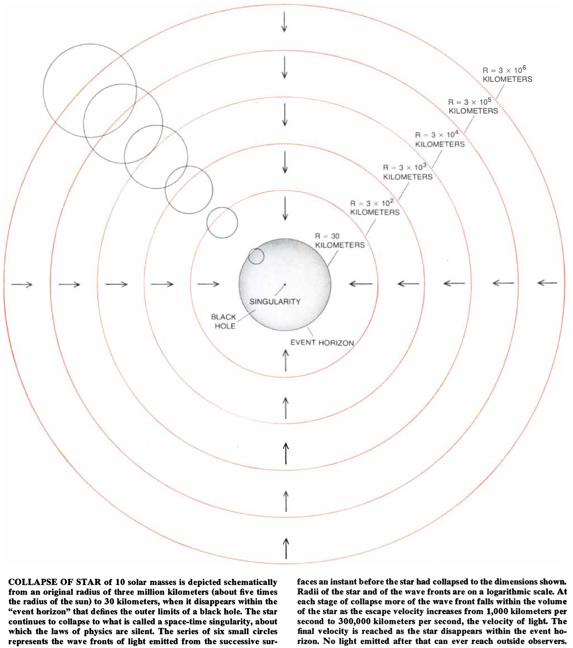
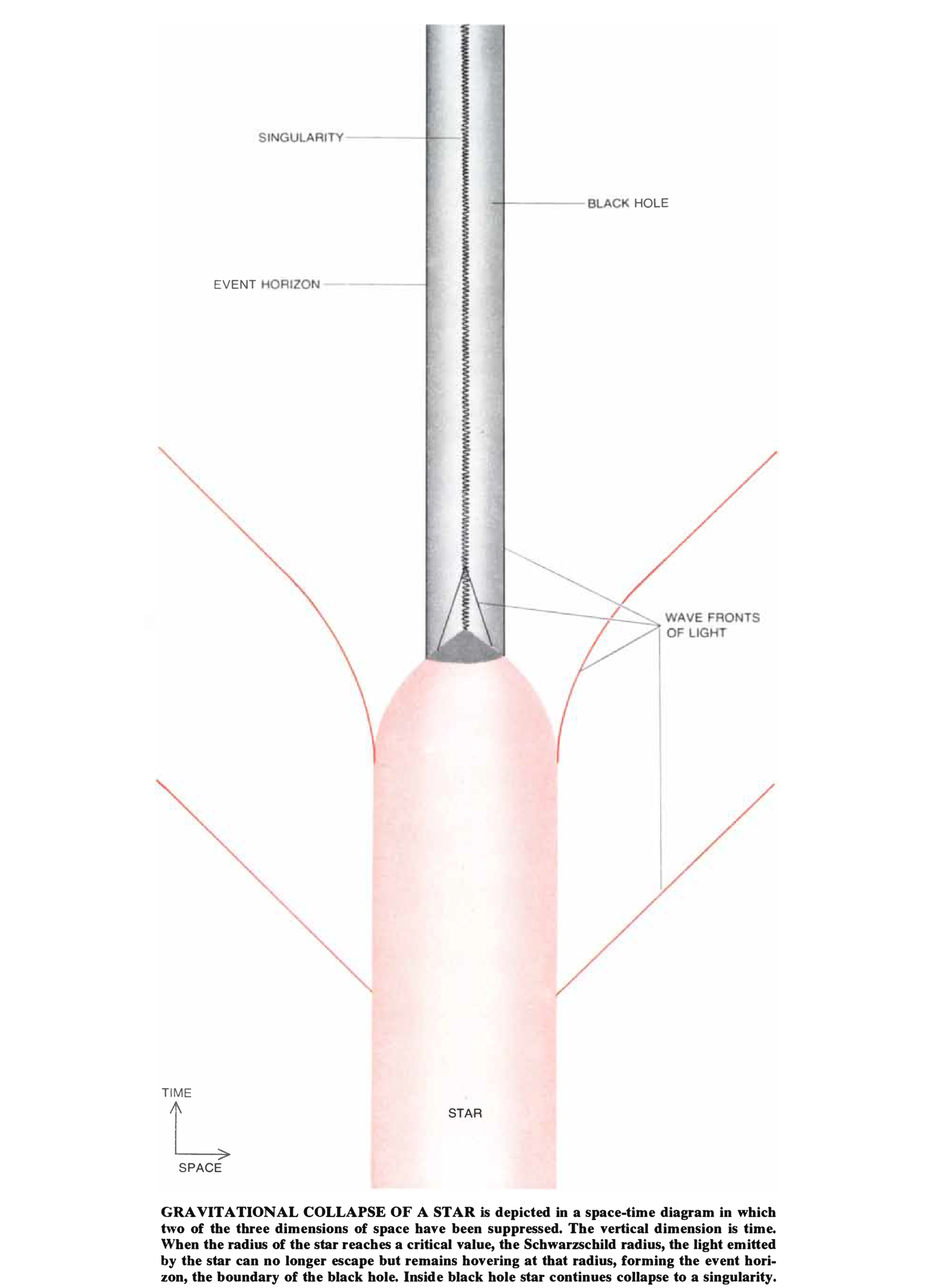
In this series of graphics from 1972, the Penrose diagram is reimagined as a sort of technical diagram in three dimensions. The drawings are minimal, but clear; the labeling and captions are carefully crafted to explain what each piece of geometry denotes, and by offering the viewer multiple vantage points, the physical structure of the black hole and its effects on various entities—time, space, light—become apparent.
However, I had yet to address the information paradox. For that, I consulted another set of infographics, this one from a 1977 Scientific American article by none other than Stephen Hawking. Using the same technical-diagram approach, this series of graphics addresses what happens to particles that fall into a black hole. Again, a well-ordered series of minimalist drawings accompanied by explanatory text effectively introduce what is inherently difficult to visualize.
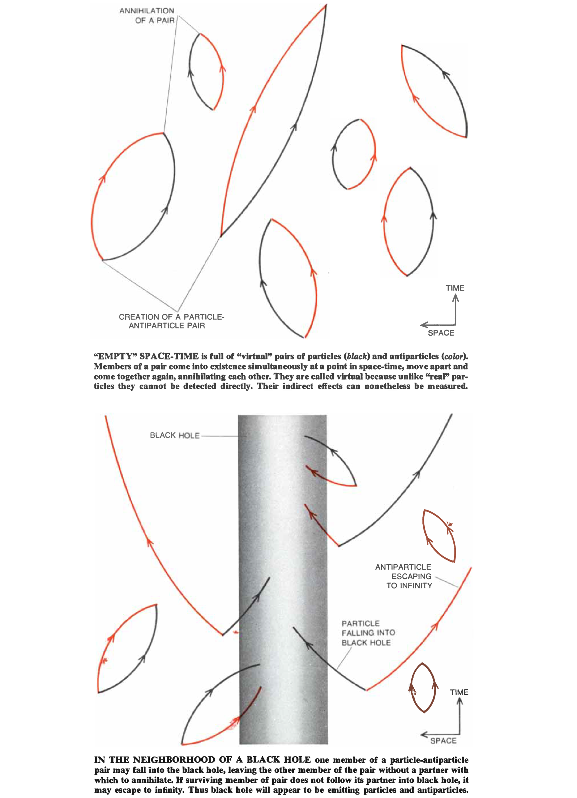
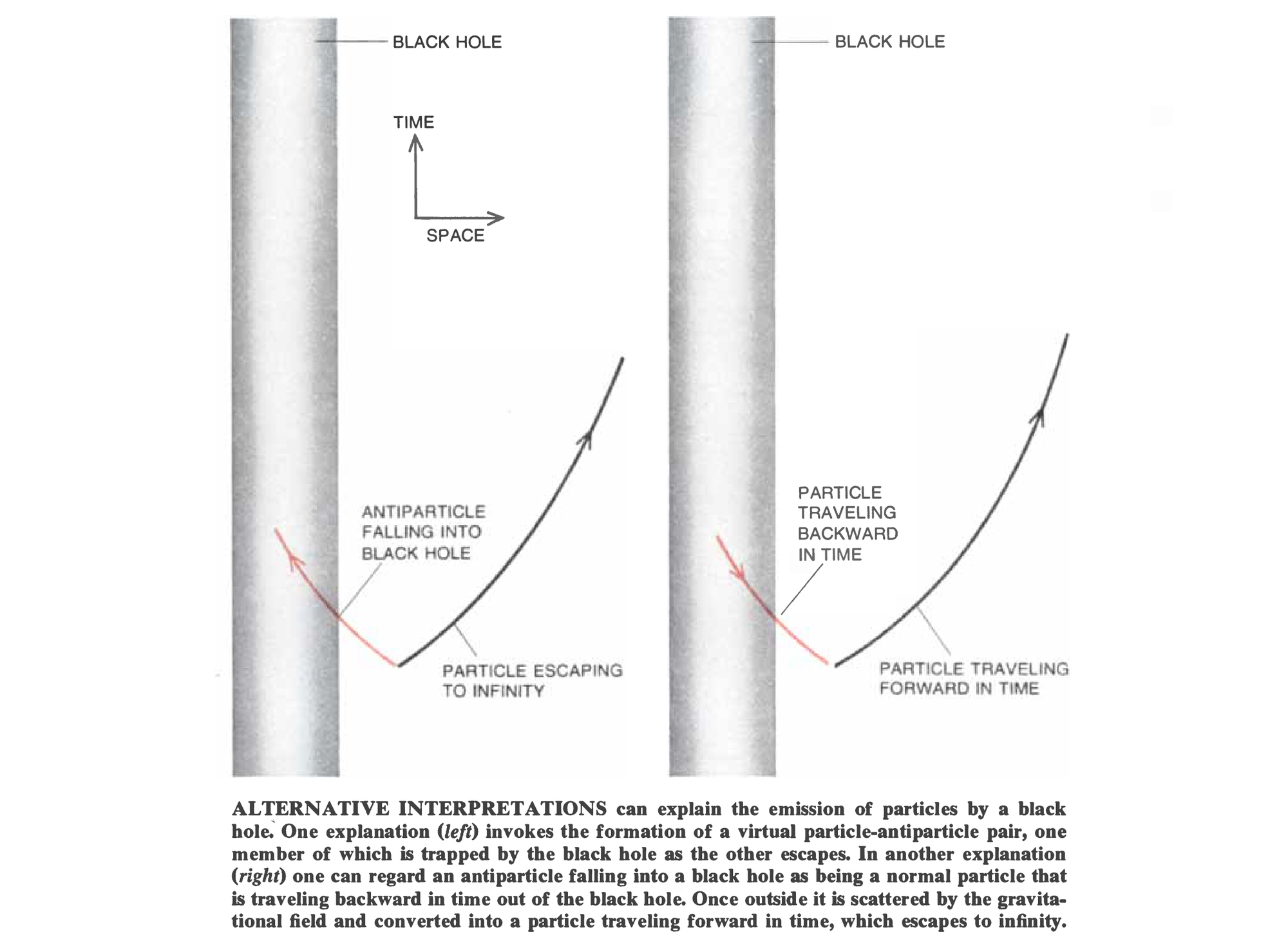
Graphics by Dan Todd
Of course, to advance my understanding towards the latest theoretical breakthroughs, I would have to find something a bit more recent. This graphic from an April 2015 article on firewalls—a theory that attempts to resolve the information paradox—would do the trick.
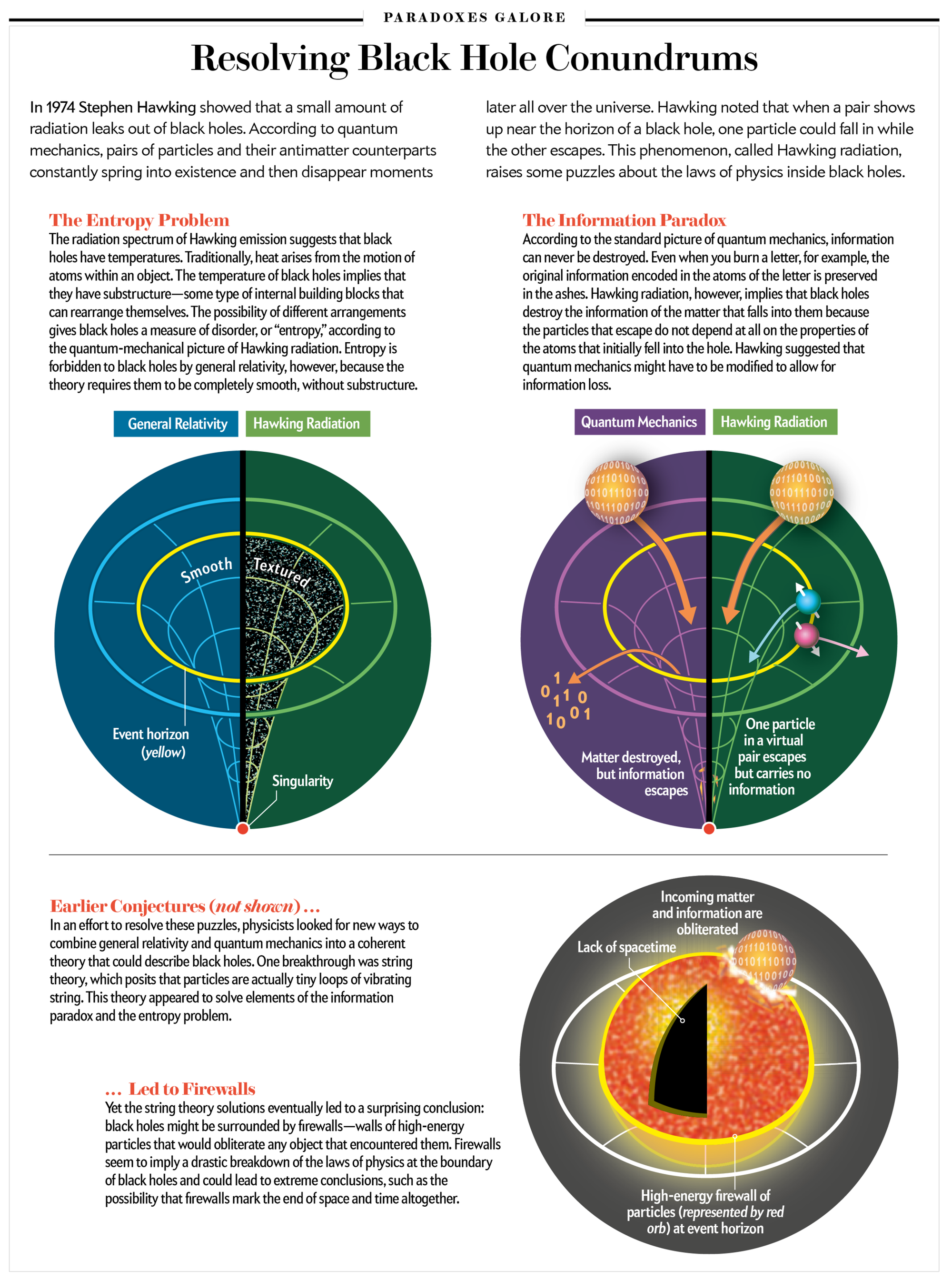
Graphic by Jen Christiansen
As one would expect, this graphic is stylistically quite different from the others I’ve just cited. However, it retains the important qualities that made its 1970s counterparts successful: a consistent and economical visual language, deliberate organization, and clear labeling and annotations.
So, I can now say that I am closer to understanding the soft hair theorem. At the very least, I appreciate the underlying quandary and what is meant by “hair” in this context. But I still have yet to grasp the substance of Hawking’s latest assertion. Perhaps this represents a new challenge for scientific illustrators (or at least very ambitious ones with robust backgrounds in physics): Go beyond the Penrose diagram. Make an infographic explaining the soft hair theorem. Visually oriented science enthusiasts everywhere will thank you.
