AutismMarch 17, 2026
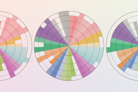
Here’s what the autism spectrum really looks like
The autism spectrum is big, vibrant and complicated, a new graphic of 39 traits shows
Amanda Montañez is senior graphics editor and been at Scientific American since 2015. She produces and art directs information graphics for the Scientific American website and print magazine. Montañez has a bachelor's degree in studio art from Smith College and a master's in biomedical communications from the University of Toronto. Before starting in journalism, she worked as a freelance medical illustrator. Follow her on Bluesky @unamandita.bsky.social
Here’s what the autism spectrum really looks like
The autism spectrum is big, vibrant and complicated, a new graphic of 39 traits shows

Rare Diagnoses Change People’s Perception of Medical Risk
How experiencing an unusual health issue can alter a person’s understanding of “rare”
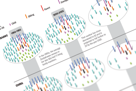
Everyone Will Have Fewer Relatives in the Future
Changing demographics mean shrinking families and more older relatives in future decades
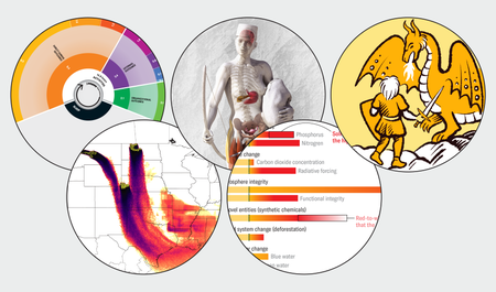
See the Best Science Graphics of 2023
Some of our favorite stories this year are best told visually
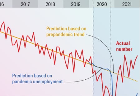
COVID Caused a Baby Bump when Experts Expected a Drop. Here’s Why
During the COVID pandemic, the U.S. initially saw a drop in births followed by a bump
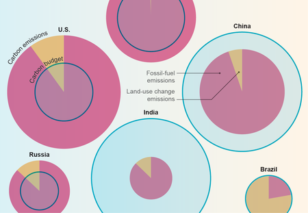
Wealthy Countries Have Blown Through Their Carbon Budgets
Some countries have used up far more of the world’s carbon budget—the amount we can emit and still avoid more extreme climate disruption—than others
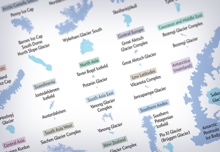
A New Map Tracks the World’s Largest Glaciers
A visualization compares the forms of Earth’s largest flows of ice

The Most Compelling Science Graphics of 2022
From COVID to space exploration, graphics helped tell some the year’s most important stories
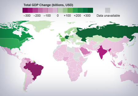
See How Much Climate Change Has Cost Different Countries
Low-income nations bear the brunt of costs from climate change

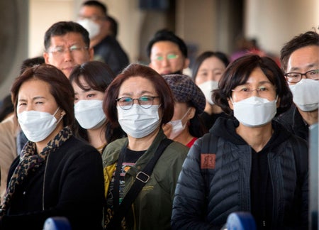
How to Compare COVID Deaths for Vaccinated and Unvaccinated People
The death rate among unvaccinated people is still far higher than that among the vaccinated even though vaccinated people now make up a significant proportion of deaths
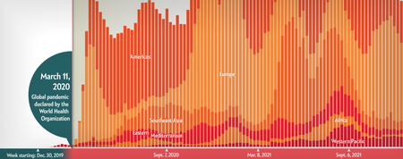
COVID’s Uneven Toll Captured in Data
Visualizing ongoing stories of loss, adaptation and inequality
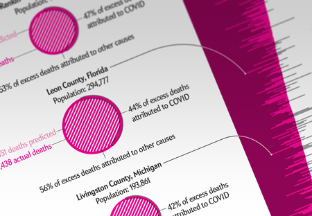
The Pandemic’s Hidden Toll Is Revealed in Excess Death Counts
Many of the unexpected deaths in rural U.S. counties last year were not recorded as caused by COVID

Evaluating COVID Risk on Planes, Trains and Automobiles
Stay safer on different forms of transportation
In 2020, Record-Breaking Hurricanes Arrived Early—and Often
A record 30 storms have formed, compared to the previous high of 28; almost all were the earliest on record
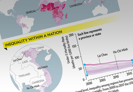
Deaths of Young Children Are Decreasing Globally, But ...
Progress in improving mortality varies significantly within countries
Carbon Taxes Would Boost Jobs across the U.S.
Construction and manufacturing careers would rise nationwide
Will the New Coronavirus Keep Spreading or Not? You Have to Know One Little Number
Whenever there’s a new outbreak, scientists rush to calculate a number called R0, or R-naught
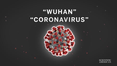
Will the New Coronavirus Keep Spreading or Not? You Have to Know One Little Number
Whenever there’s a new outbreak, scientists rush to calculate a number called R0, or R-naught. Why? It’s been a critical part of the scientific effort to understand just how transmissible the new virus is. Here’s how.
Editor’s Note (2/11/20): The video in this story has been revised after posting. It originally incorrectly referred to SARS as “sudden acute respiratory syndrome.” The full name is “severe acute respiratory syndrome.”
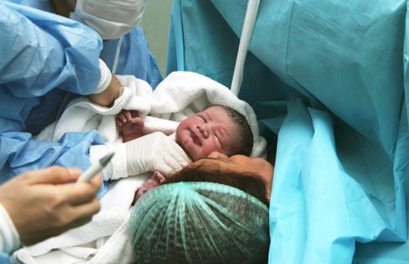
The Cost of Giving Birth in the U.S.
Data visualization reveals how much hospitals across the nation charge for some of the most common procedures

How and Why Scientists Redefined the Kilogram
Illustrations from the Scientific American archive break down this “massive” development
Remembering Bunji Tagawa
A look back at one of Scientific American’s most prolific illustrators and the racial injustice he endured
How Much of the World’s Protected Land Is Actually Protected?
Intense human pressure on areas set aside for preservation could be threatening biodiversity
New Hope for a Better Flu Vaccine
Infographic shows how an experimental approach might bring us closer to a universal vaccine

People Who Understand Evolution Are More Likely to Accept It
Even among the religious and conservative, knowledge of the theory influenced belief