
EnvironmentApril 20, 2018
How Deep Is Your Carbon Footprint?--Celebrate Earth Day with Data
An infographic reveals the most effective ways to live more sustainably
Amanda Montañez is senior graphics editor and been at Scientific American since 2015. She produces and art directs information graphics for the Scientific American website and print magazine. Montañez has a bachelor's degree in studio art from Smith College and a master's in biomedical communications from the University of Toronto. Before starting in journalism, she worked as a freelance medical illustrator. Follow her on Bluesky @unamandita.bsky.social
How Deep Is Your Carbon Footprint?--Celebrate Earth Day with Data
An infographic reveals the most effective ways to live more sustainably

State of the Union for Life Expectancy Is Positive, but Some States Lag Behind
Newly published data highlights health trends throughout the country
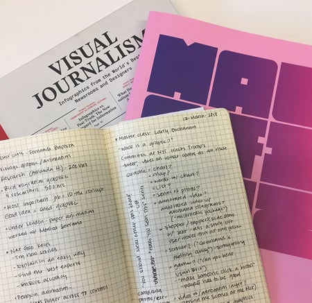
Pushing the Boundaries of "Show, Don't Tell"
Malofiej 2018 and the role of infographics in the evolution of storytelling

A New Frontier: Data Visualization for Human Rights
What I learned in a five-day workshop in Beirut
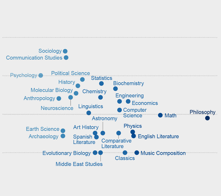
This Is What the Race Gap in Academia Looks Like
Data visualization highlights a problematic pattern in fields associated with intrinsic genius
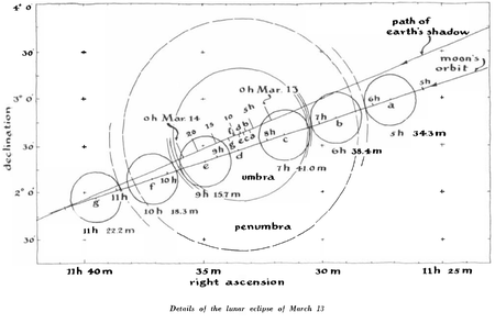
Photographing a Lunar Eclipse in 1960 Took More Than a Snap
Diagrams from the Scientific American archive document a feat of citizen science
The Data behind the Women's Movement
Charts highlight some of the key issues Women’s March activists are fighting for

When 2 (Disciplines) Become 1
Reflections on the convergence of art and science

Cetaceans’ Big Brains Are Linked to Their Rich Social Life
Studying whale and dolphin anatomy and behavior could offer insights into human evolution
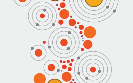
A Visual Guide to the Search for Exoplanets
This infographic highlights the diversity of our closest stellar neighbors and the planets they host
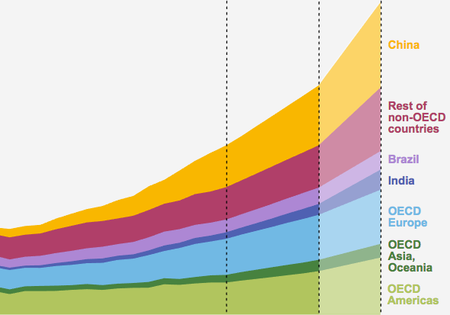
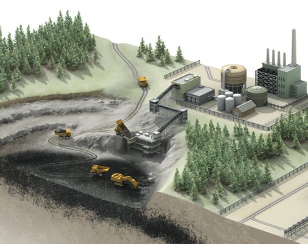
China Takes the Lead on Clean Energy
Three charts reveal how China’s increased investment in renewables is leaving the U.S. in the dust
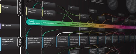
Beyond XX and XY: The Extraordinary Complexity of Sex Determination
A host of factors figure into whether someone is female, male or somewhere in between

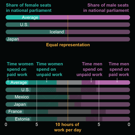
The Persistent Problem of Gender Inequality
The gender gap remains a global phenomenon
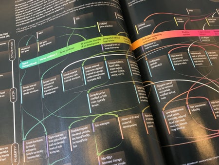
Visualizing Sex as a Spectrum
Infographic reveals the startling complexity of sex determination
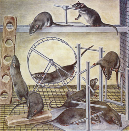
Remembering Marian C. Diamond
Illustrations from the Scientific American archive highlight key discoveries of an influential neuroscientist
Beyond Medical Illustration
The surprising applications of a profession you may not know exists
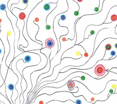
Illustrating Mental Illness
Researcher embraces data art as a way to diagram her own anxieties

What Does a Black Hole Really Look Like?
39-year-old drawing hints at what the Event Horizon Telescope may have just captured: the true shape of a black hole
Pi in the Sky
Elegant new visualization maps the digits of pi as a star catalogue

This Is Your Brain on Poverty
Data visualizations highlight the surprising connections between income and brain structure
Humans Start Most Wildfires
People are responsible for much of the rising cost and ecological damage that wildfires impose
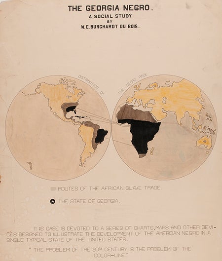
W.E.B. Du Bois, Scientific American and Data Stories of the Early 1900s
Two sets of infographics offer distinct perspectives on American life at the turn of the century
Visualizing the True Cost of Oil Pipelines
Graphics highlight key information about Dakota Access and Keystone XL pipelines
Groundhog Day Is Hogwash
Sure, Punxsutawney Phil is fun to watch, but his annual predictions about spring are no better than chance