BiologyJanuary 26, 2017
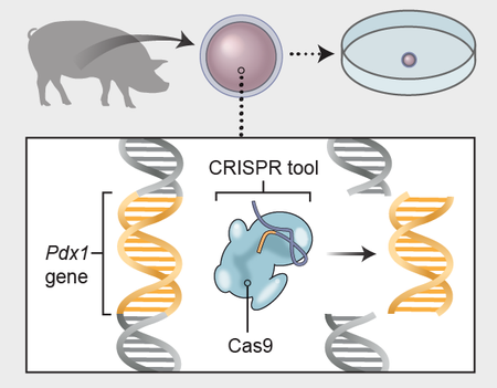
How to Grow Human Organs in a Pig
Infographic shows new research developments and future hopes for human/animal chimeras
Amanda Montañez is senior graphics editor and been at Scientific American since 2015. She produces and art directs information graphics for the Scientific American website and print magazine. Montañez has a bachelor's degree in studio art from Smith College and a master's in biomedical communications from the University of Toronto. Before starting in journalism, she worked as a freelance medical illustrator. Follow her on Bluesky @unamandita.bsky.social
How to Grow Human Organs in a Pig
Infographic shows new research developments and future hopes for human/animal chimeras
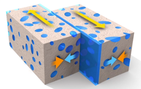
Visualizing the Medical Isotope Crisis
Information graphics help to clarify a little-known but critical challenge to the health care industry
How Science Visualization Can Help Save the World
Information graphics and the fight for science in Trump’s America

Visualizing the Rhythm of Food
Interactive data visualization charts the changing popularity of 195 different foods over time
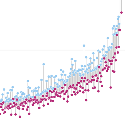
The Science of Success in Science
Interactive data visualization traces the career paths of over 10,000 scientists in search of predictable patterns of impact
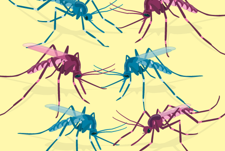
A Visual Guide to Modified Mosquitoes
Three information graphics show how scientists are tackling disease-ridden mosquito populations around the world

Conservative Republicans Really Distrust Climate Scientists [Graphic]
They also say the scientists’ research findings are influenced by political leanings
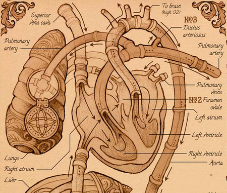
The Visual Story of the Human Heart
Information graphic captures the complex science of embryonic heart development
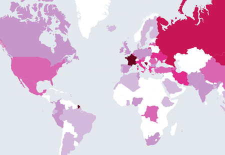
The State of Vaccine Skepticism in 4 Maps
Interactive graphic reveals data from a recent study on vaccine confidence around the world
As Wilderness Disappears, So Do Animals [Graphic]
More terrestrial mammals are being stressed as their habitats shrink
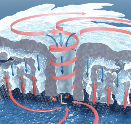
Visualizing Hurricanes
Information graphics demystify Earth’s most powerful storms
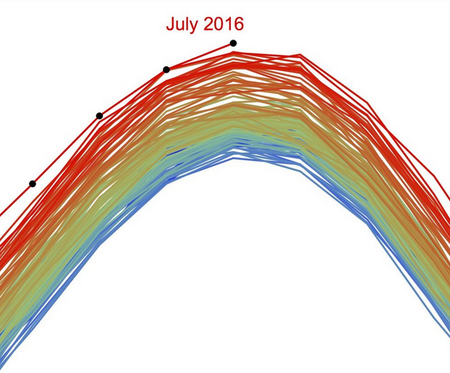
The Hottest Weather Ever Visualized
New data graphics offer an alarming view of global climate change
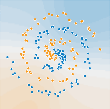
Data Visualization and Feelings
Psychology project explores human emotions through interactive visualizations
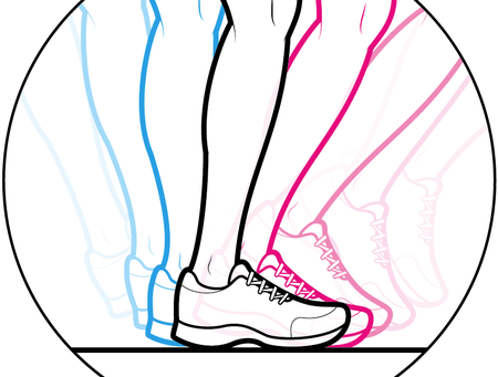
A Visual Guide to Running Like an Olympian
Information graphic breaks down the physics of human speed
The Boundless Beauty of Pi
A mathematical value with infinite digits provides limitless inspiration for data artists
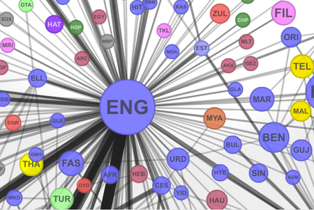
Visualizing the Global Network of Languages
Interactive visualization uses translation data to explore connections among world languages
Fracking, Earthquakes and Visual Storytelling
Animated and interactive graphics describe the connection between oil and gas production and human-caused earthquakes
A Visual Feast
Three new infographics highlight changing diets around the world
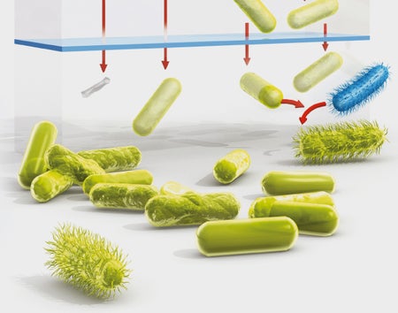
A Visual Guide to Antibiotic Resistance
Illustration breaks down the microscopic mechanisms behind a global threat
The Pay Gap, Visualized and Analyzed
An interactive graphic visualizes the pay gap between U.S. men and women, while a new study reveals the origins of pay gaps in science
Unveiling the Hidden Layers of Deep Learning
Interactive neural network “playground” visualization offers insights on how machines learn
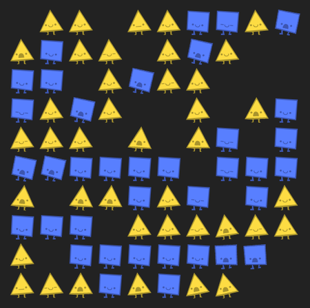
Everyone’s a Little Bit “Shapist”
On happy little squares, thought experiments and visualizing social systems
The Beautiful Complexity of the Cosmic Web
3D interactive visualization lets users explore the vast, hidden structure of the universe
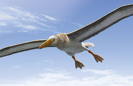
Visualizing a Really Big Bird
Infographic depicts extinct avian giant that once dominated South Carolina skies