The SciencesMarch 14, 2016
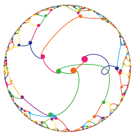
The Gravity of Pi
Martin Krzywinski’s latest “Pi Day” graphic re-imagines numerical digits as physical masses
Amanda Montañez is senior graphics editor and been at Scientific American since 2015. She produces and art directs information graphics for the Scientific American website and print magazine. Montañez has a bachelor's degree in studio art from Smith College and a master's in biomedical communications from the University of Toronto. Before starting in journalism, she worked as a freelance medical illustrator. Follow her on Bluesky @unamandita.bsky.social
The Gravity of Pi
Martin Krzywinski’s latest “Pi Day” graphic re-imagines numerical digits as physical masses
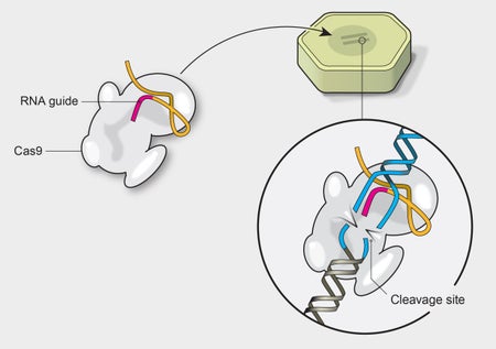
A Visual Guide to Genetic Modification
Infographic compares CRISPR technology to other GM methods used in crops

The Demographics of Space Travel
This interactive data visualization shows the birth year of every human who has been to space
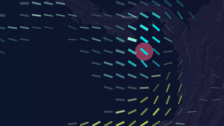
The Data, My Friend, Is Blowing in the Wind
Interactive data visualization maps predicted wind speeds around the world

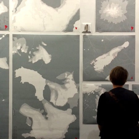
A Visual (Information) Paradox
Search for answers about Stephen Hawking’s new theorem reveals a Scientific American tradition of illustrating the confounding complexity of black holes
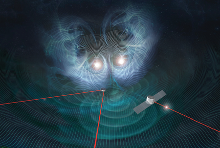
LIGO and Gravitational Waves: A Graphic Explanation
Infographic from Scientific American breaks down the technology behind our ongoing search for ripples in spacetime
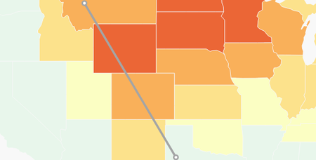
A Visual Forecast for the End of the Century
Interactive Climate Graphic Highlights Alarming Trends in Warming U.S. Winters
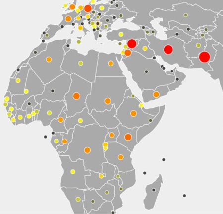
Refugee Data Tells Visual Stories of a Changing World
Two interactive infographics help users visualize today's global refugee crisis and compare it with similar crises in the past
Art Can Highlight Climate Change, But Where is the Data?
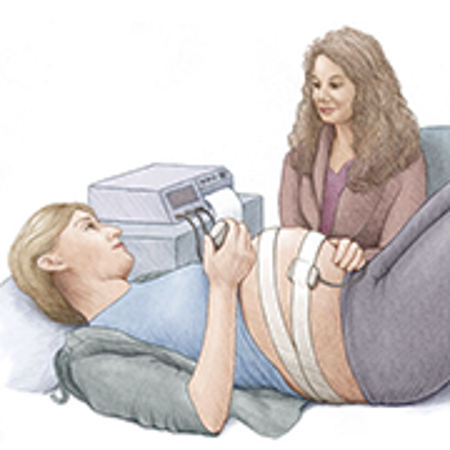
Inadequate Data Visualization Leaves Patients Undereducated

As Earth's Spin Slows, Clocks Get Another Leap Second
The history of the leap second reveals a curious pattern of decreasing frequency since its adoption 43 years ago
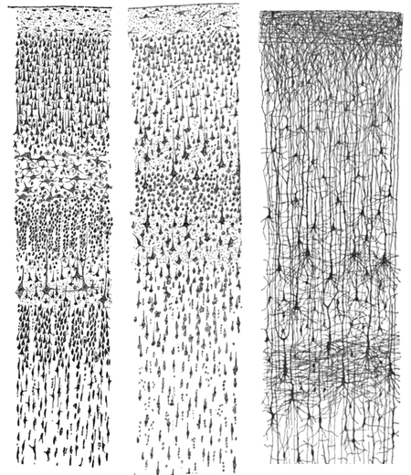
Ramón y Cajal and the Case for Drawing in Science