
This article was published in Scientific American’s former blog network and reflects the views of the author, not necessarily those of Scientific American
Earlier this month, an exciting new collaboration in data visualization, technology, and climate science made its public debut. Project Ukko comprises an enormous amount of data on past, present, and future wind speeds around the world. My first thought upon learning of the project was that it takes a brave designer to follow Fernanda Viégas and Martin Waatenberg in the world of elegant, data-driven wind maps. Leave it to Moritz Stefaner of Truth & Beauty Operations (and Scientific American infographics fame), not just to take such a project on, but to knock it out of the park.

Project Ukko is a FutureEverything and BSC project for EUPORIAS with data visualisation by Moritz Stefaner
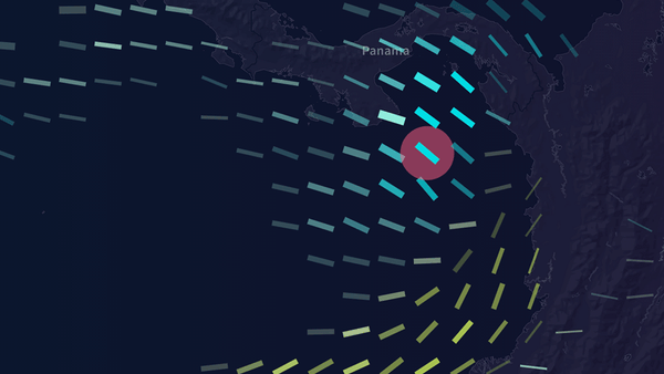
Click image above to launch
At a basic user experience level, Project Ukko is a classic implementation of Ben Schneiderman’s mantra on interactive data visualization: overview first, zoom and filter, then details on demand. Start with an overall view of the map, and become acquainted with the key graphical indicators. Right away, the tooltips and cursor cues invite intuitive actions: zoom in and out, pan around, and click on different locations. Then, as the information bar appears at the bottom of the screen, hover over each data point to reveal its specific associated values.
On supporting science journalism
If you're enjoying this article, consider supporting our award-winning journalism by subscribing. By purchasing a subscription you are helping to ensure the future of impactful stories about the discoveries and ideas shaping our world today.
What is truly impressive about the visualization, however, is the skillful consolidation of many dimensions of data. Even for experts in the field, this is often the most challenging part of visualizing a particularly rich dataset: how to show all relevant facets of the data one in unified, economical, and legible composition that tells the story effectively? Stefaner has used principles of visual perception to convey the most important parts of the story up front. Line thickness clearly denotes amplitude (i.e. wind speed). Change over time is captured primarily (and logically) by line slope, but also secondarily by color—an interesting design decision which serves to emphasize this aspect of the data without compromising accessibility for color blind users. Finally, opacity is employed to express varying degrees of certainty about the quality of data (“skill”), often a problematic variable in data visualization.
It may be worth noting that, in contrast to Viégas and Waatenberg’s wind map, wind direction is not indicated here. Since wind turbines are designed to turn in response to wind direction, this would not be a relevant variable for Project Ukko’s purpose of determining where wind power would be most efficient.
Perhaps the only thing missing from this graphic is a field defining the location for each data point. While this information can be roughly inferred based on the position of each line on the map, their precise locations are not immediately clear, and it’s easy to lose track of the geography upon zooming in.
Minor criticisms aside, this project represents a remarkable feat in data visualization, and more broadly, a triumph of collaboration. Presented as a predictive tool for use in the wind energy industry, it has practical applications that stand to make a difference in the real world. Moreover, it shows what can happen when science, technology, and information design come together in pursuit of a common goal. When such collaborations go well, the result is often as beautiful as it is instructive.