
This article was published in Scientific American’s former blog network and reflects the views of the author, not necessarily those of Scientific American
As we enter peak hurricane season, I am prompted to reflect on the scientific story behind these formidable storms. Each year, their occurrence is simultaneously inevitable and unpredictable. And when a particularly destructive one hits, we are shocked into the realization that we humans, despite all our collective strength, wisdom, and world-changing technologies, are sometimes uncomfortably tiny and powerless.
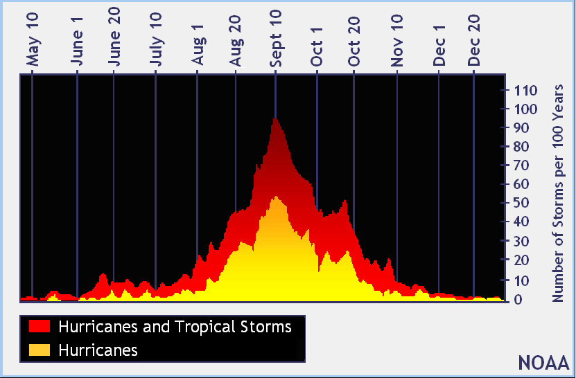
So, what do we know about these remarkable weather events? Surely there is plenty of reading to be done on the subject, but like many scientific phenomena, their story may be most effectively told through information graphics.
This illustration from the October 2004 issue of Scientific American explains how hurricanes form. (It’s worth noting that the article, called “Controlling Hurricanes,” describes scientists’ ambitions to lessen the impact of hurricanes by altering the conditions in which they originate. Twelve years later, this goal still appears far out of reach.)
On supporting science journalism
If you're enjoying this article, consider supporting our award-winning journalism by subscribing. By purchasing a subscription you are helping to ensure the future of impactful stories about the discoveries and ideas shaping our world today.

Graphic from “Controlling Hurricanes,” by Ross N. Hoffman, Scientific American, October 2004. Credit: DAVID FIERSTEIN
Another important part of the story is where hurricanes happen. The map below by John Nelson is a visual summary of the geography of hurricanes, showing every hurricane recorded from 1851 to 2012, when the map was produced. The South Pole stereographic projection is quite revealing, and remarkable in that data itself almost seems to approximate the spiral shape of a hurricane.

Credit: JOHN NELSON
Click the image to launch the full-size visualization
Nelson’s elegant visualization was widely celebrated and shared when he posted it on his blog four years ago. Recently, he revisited the project in the form of a June 2016 post on his new blog, explaining how he created the map.
So, while we’re unlikely to be able to control hurricanes anytime soon, we can at least visualize them with impressive precision. Understanding their behavior on both local and global scales is an important step in the effort to mitigate the destruction wrought by these enormous and volatile beasts of nature.