
This article was published in Scientific American’s former blog network and reflects the views of the author, not necessarily those of Scientific American
On March 14th of this year, I wrote about Martin Krzywinski’s 2016 “Pi Day” visualization, in which each digit of pi was reimagined as a physical mass, governed by the laws of gravity. This was the latest in a series of pi-themed visualizations by Krzywinski, who is both a scientist and a data artist; he has come out with a new graphic for Pi Day each year since 2013, and just came out with a brand new visualization for Pi Approximation Day.

2016 Pi Day visualization by Martin Krzywinski
Evidently, I was not the only one intrigued by Krzywinski’s work. Nadieh Bremer, another scientist-turned-data-visualizer, responded in 2015 with her own pi-based graphic. In honor of Pi Approximation Day (July 22nd, also denoted as 22/7, a fraction that is about equal to pi), here are a few snapshots of Bremer’s work.
On supporting science journalism
If you're enjoying this article, consider supporting our award-winning journalism by subscribing. By purchasing a subscription you are helping to ensure the future of impactful stories about the discoveries and ideas shaping our world today.

.png?w=1350)
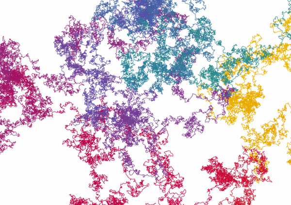
.png?w=1350)
Images from “Exploring the Art Hidden in Pi” by Nadieh Bremer
The main premise here, as signified quite elegantly in the legend above the first iteration of the graphic, is that each successive digit of pi is visualized as one “step” in a different direction. The visualization becomes increasingly dense and convoluted as more digits of pi are added. And interestingly, somewhere between 1,000 and 10,000 digits, the configuration seemingly begins to mimic certain natural structures, like intricately folded proteins or crystal formations. As is so often the case when data and art come together, Bremer’s work is as surprising and complex as it is beautiful.
