

Climate change just got another telling visual courtesy of the famed temperature spiral creator. But rather than a graph, it’s a series of 167 maps.
Alone, they each tell the story of whether a year was mostly hot or mostly cold or mostly average. Together, they show unequivocally how much our planet has warmed since the 1850s, including the rapid rise over the past three decades.
Ed Hawkins, a climate scientist at the University of Reading, is responsible for the latest visual. You may remember him from the temperature spiral that went viral earlier this year. Turns out he’s still turning out compelling graphics to show the impact humans are having on the place we call home.
On supporting science journalism
If you're enjoying this article, consider supporting our award-winning journalism by subscribing. By purchasing a subscription you are helping to ensure the future of impactful stories about the discoveries and ideas shaping our world today.
Using a technique called “small multiples” developed by data visualization expert Edward Tufte, Hawkins mapped out the annual average temperature anomaly for every year from 1850 through 2016 using data from the UK Met Office.

These maps show how much the planet has warmed every year since 1850. It's really worth viewing this large (clicking that link will open a 10 MB file). Credit: ED HAWKINS
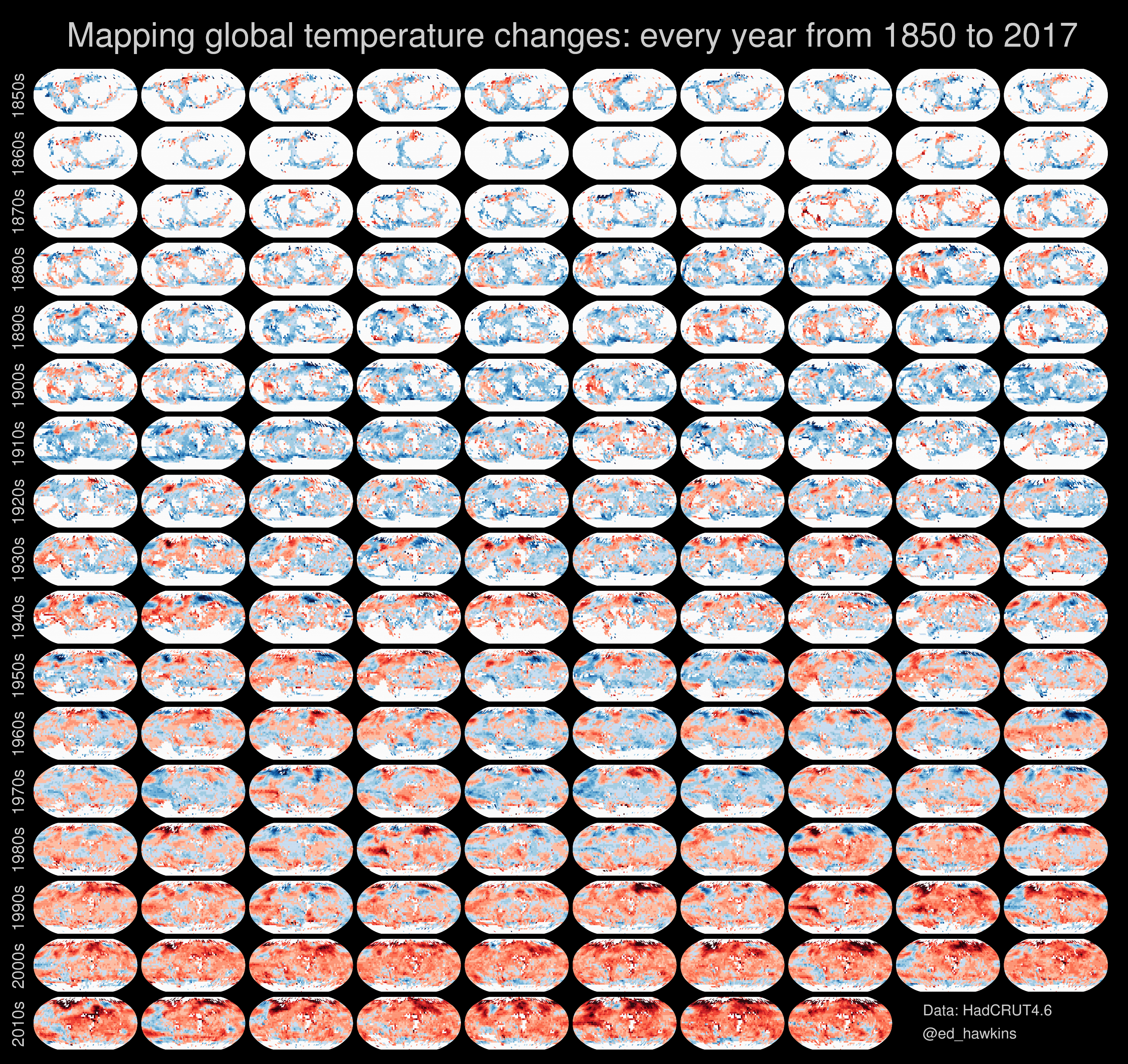
The technique allows viewers to consume a lot of information and then start searching for patterns in the data. It makes a lot of sense to use when it comes to climate change, which has driven up surface temperatures across the world but in a non-uniform way.
There are patterns galore to dissect. The series of maps reads like a greatest hits collection of climate. You can see the ebb and flow of El Niño and La Niña in the tropical Pacific, punctuated by the flaming red record El Niño of 1997-98. The rapid warming of the Arctic compared to the rest of the globe is also clear as deep reds become more and more common there over the years.
And then there’s the back-to-back-to-back record hot years of 2014, 2015 and 2016 (in all likelihood anyways). Oh, and there’s that odd patch of persistent coolness off the tip of Greenland in recent years, which scientists think might be due to a massive influx of freshwater from the island’s melting ice sheet.
Hawkins colored any square where six months of data is missing as a light gray. That adds yet another layer to the visualization, showing how much better our record keeping has become thanks to more ships, satellites and thermometers taking measurements around the world.
Taken together, these images tell a bigger story. They chronicle the history of a planet that’s become warmer and warmer as humans have filled the atmosphere with carbon pollution.
This article is reproduced with permission from Climate Central. The article was first published on August 31, 2016.